Create Email Template
Quick Steps Guideline
Settings > Mail Templates > Create Email Template
Open Mail Templates.
Click Create Email Template.
Set Template Label and Email Type.
Fill sender details and subject fields.
Build the layout with Structures and Blocks.
Preview, test, then Save.
Windows Outlook Configurations
Some versions of Windows Outlook may display distortions if CSS definitions are missing or not properly applied. To ensure consistent apperance across all email clients, especially Outlook, make sure your template includes media styles in the CSS section.
Adding media styles in the CSS section:
Open the template and switch to the Code Editor.
Open the CSS tab in the top right corner.
Add your media style definitions and save them.
Test: Preview in several different clients (Outlook, Gmail, Apple Mail).
Example:
@media only screen and (max-width: 600px) {
body {
background-color: lightblue;
}
}Template Attributes

Template Label
Internal name visible only to you. Choose descriptive names to quickly identify templates.
Email Type
Select one: - Notification: For transactional emails (password resets, confirmations). Sent to all users regardless of opt-in. - Campaign/Advertisement: Marketing emails sent only to opt-in users.
From Address
Pre-registered sender email address visible to recipients.
Sender Name
Display name your recipients will recognize (e.g., company name).
Mail Subject
Clear, concise email subject reflecting email content.
Mail Pre-header
Optional preview text shown after the subject line (min 40 characters recommended).
Reply Email
Optional reply-to address if you want recipients to reply directly. Leave blank to disable.
Important Notes on Email Type and Opt-Outs
Notification emails bypass opt-in preferences and send to all users; intended for essential info.
Campaign emails respect opt-in status, sending only to users who have not unsubscribed.
Netmera Email Editor

Structures & Modules
Predefined layouts organizing content (e.g., one-column, two-column). Easily dragged into the template workspace. You can customize borders (size, color, rounded edges) individually or collectively.

Blocks (Icon Toolbar)
On the left side of the editor, the icon-based toolbar (highlighted in green) provides access to all available content blocks. Blocks are drag-and-drop elements used inside predefined layouts to build email content. Customizable properties include font, alignment, colors, padding, and size.
Image
Adds an image (or GIF) to your email.
Upload from your library or use a URL
Optional link on click
Responsive sizing inside the layout
Size and alignment
Padding and background
Border and corner radius
Logos, hero images, product shots
Text
Adds formatted text content.
Headings, paragraphs, lists
Links
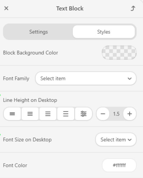
Font, size, color
Alignment and line spacing
Padding
Body copy, disclaimers, announcements
Button
Adds a call-to-action (CTA) button.
Custom label + link
Works across all email clients
Button + text colors
Border and corner radius
Alignment and padding
Shop now, reset password, confirm email
Spacer
Adds vertical spacing between blocks.
Fixed-height whitespace
Height
Background (optional)
Separate sections and improve readability
Social
Adds social media icons with profile links.
Common networks (e.g., Instagram, X, LinkedIn)
Click-through links
Icon style and size
Spacing and alignment
Footer social links
Menu
Adds navigation links similar to website headers.
Multiple links
Horizontal or vertical layout
Optional separators
Font and color
Alignment
Padding and spacing
Navigation for newsletters and multi-section emails
HTML
Inserts custom HTML/CSS.
Full control for advanced layouts
Email client support may vary
HTML/CSS
Custom components, bespoke layouts
Banner
Highlights a promotion with a prominent visual.
Image + optional title/caption
Optional link on click
Spacing and alignment
Background
Promotions, featured announcements
Video
Adds a video preview that links to a video URL.
Thumbnail + play indicator
Opens the video externally when clicked
Video URL
Thumbnail image
Alignment and padding
Product demos, webinar invitations
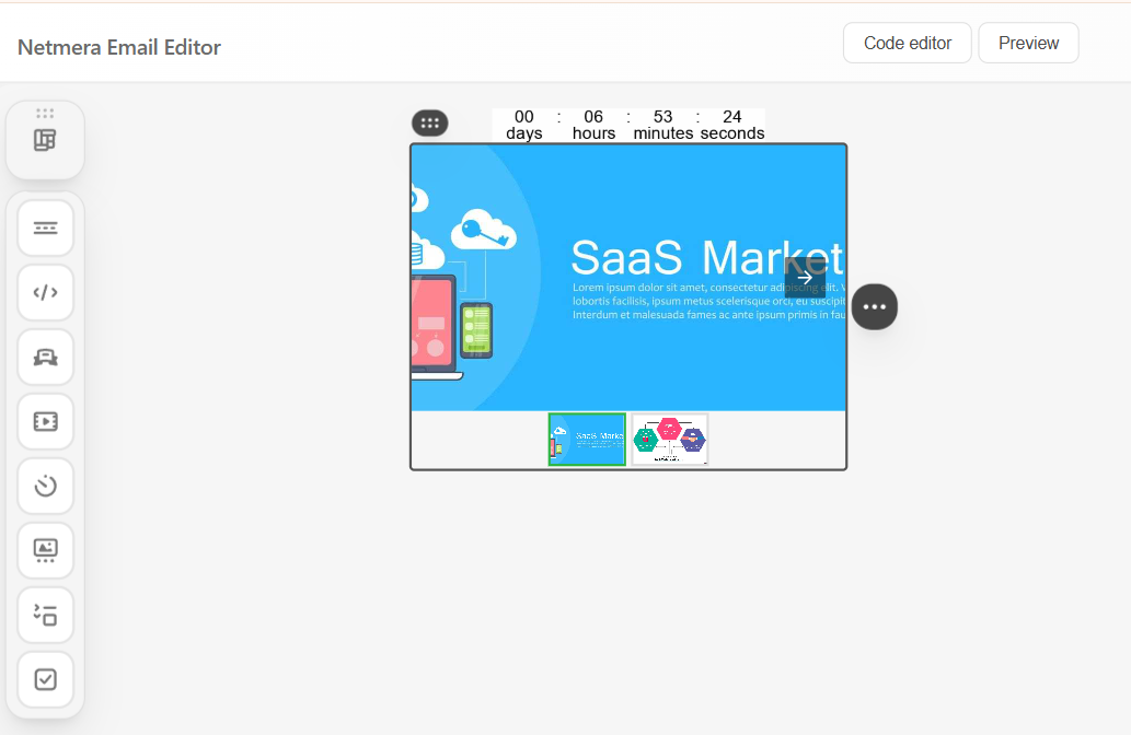
Timer
Adds a countdown timer to a target date/time.
Counts down to a specific date/time
Can hide or replace after expiry
Font and colors
Background and border
Time unit display
Flash sales, limited-time offers
Carousel
Shows multiple images/items in a slider.
Multiple images with links
Auto-play or manual controls
Transition and indicators
Background/border styling
Product galleries, highlights, testimonials
Accordion
Expandable sections for long content (AMP-only).
Multiple sections (header + body)
Expand/collapse interaction in AMP-supported clients
Header/body styles
Borders and spacing
FAQs, long-form content without scrolling
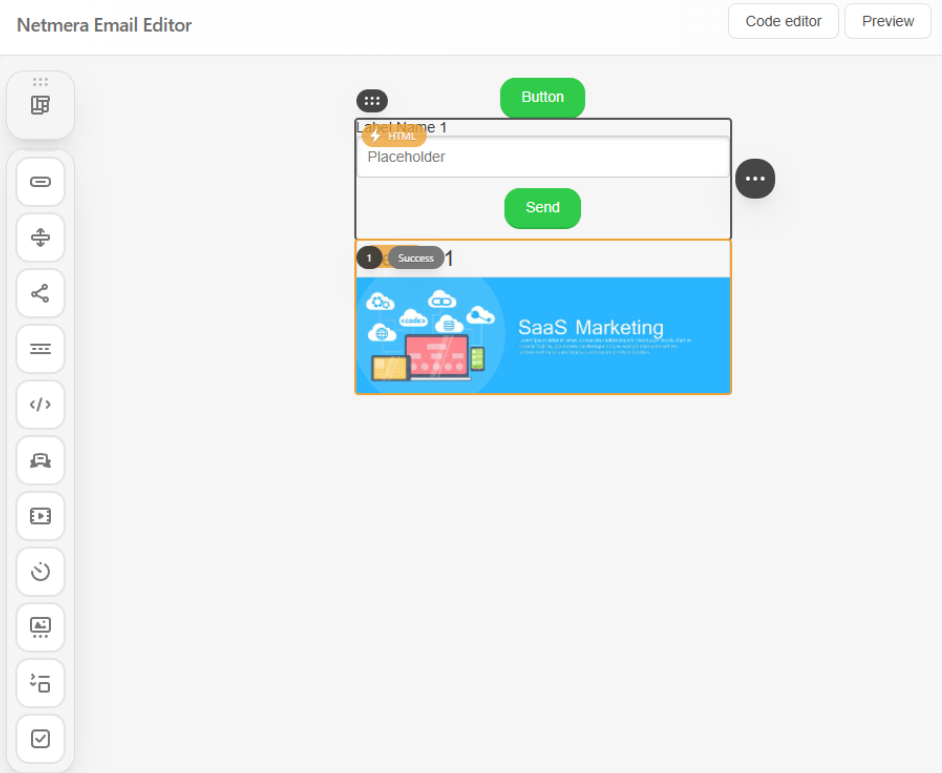
Form
Collects input inside the email (AMP-only).
Input fields + submit button
Requires external handling/endpoint
Required fields and placeholders
Label/field styling
Spacing
Surveys, RSVPs, quick lead capture

Content Blocks
Used to display static or custom content within the email.
Image – Upload and edit images and GIFs.
Text – Add text, headings, merge styles and lists.
Banner – Image and text combinations for highlighted sections
HTML – Add element with custom HTML/CSS for advanced layouts


Action & Engagement Blocks
Designed to encourage interaction directly from the email.
Button – Call-to-action elements
Form – Collect user input (surveys, RSVPs, contact forms; handled externally)
Accordion – Expandable sections for structured content
Note: Accordion and Form blocks are AMP-based components. They are supported only in the AMP HTML version of the email. If the recipient’s email client does not support AMP:
Accordion content will not be interactive
Form submissions will not work inside the email Form submissions always require external handling.


Layout & Structure Blocks
Used to control spacing and navigation.
Spacer – Add vertical spacing
Menu – Display navigation links


Dynamic / Media Blocks
Used to add dynamic or time-based content.
Carousel – Rotating images or content
Timer – Countdown timers
Video – Video previews or thumbnails


Social & Utility Blocks
Supporting elements commonly used in emails.
Social – Social media icons and profile links


Modules
Save reusable content blocks or full templates for future use
Search and filter modules by name or tags
Edit or delete modules as needed


Visual Configuration
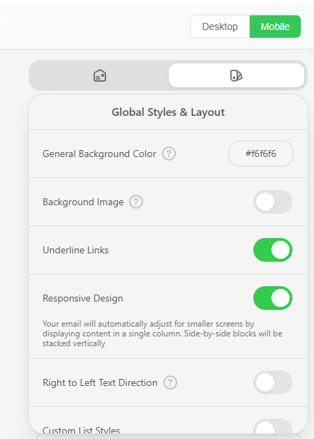
Visual Configuration refers to global style settings available in the Global Styles & Layout panel. These settings affect the entire email template and remain active regardless of which block is selected.
Typical use cases include:
Defining a consistent content width
Controlling spacing and margins across the template
Applying background colors or background images
Ensuring the layout adapts correctly on different devices
These configurations apply globally and are independent of individual content blocks.


Global Appearance & Layout
The Global Styles & Layout panel allows you to configure visual settings that apply to the entire email template. Unlike block-level settings, the options in this panel remain active regardless of which content block is selected.
Default Padding – Control the spacing between content and template edges, either globally or per section.
Background Color – Set a base background color for the entire template.
Font and Line Spacing – Choose font styles and adjust line spacing to improve readability.
Paragraph Bottom Space – Define the spacing between paragraphs.
Underline Links – Toggle link underlining to make links more visible.
Responsive Design – Ensure the layout adapts properly to mobile devices.
RTL Text Direction – Enable right-to-left text flow for supported languages.
Background Image – Upload a PNG, JPG, or GIF (max 1 MB), or use a URL to add a background image.
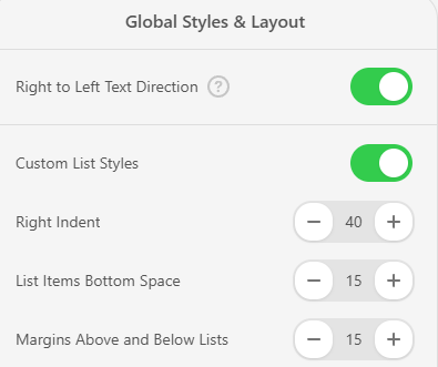
Custom List Styles – Adjust list indentation, spacing above and below lists, item spacing, list type (bulleted or numbered), and list marker color.
Dynamic Behavior
The settings panel updates automatically based on the selected element:
When no block is selected, global email settings are displayed.
When a content block is selected (e.g., Button, Image, Form), block-specific settings appear.
The available options change dynamically depending on the current selection.
The available settings change automatically depending on the selected element.
Message Settings
The Message Settings tab is used to configure email-level properties that are not related to layout or content blocks.
These settings define how the email appears in the recipient’s inbox before it is opened.
You can configure the following options:
Subject / Title Defines the email subject line displayed in the inbox. &#xNAN;Recommended length: up to 65 characters.
Hidden Preheader A short preview text shown next to the subject line in inboxes. &#xNAN;Recommended length: 50–100 characters.
Email Annotations for Gmail Allows you to highlight deals, discounts, or offers directly in Gmail’s Promotions tab, especially on mobile devices.
UTM Parameters Automatically adds UTM tags to all links in the email to support campaign tracking in tools like Google Analytics.
Stripes
Stripes are horizontal sections used to structure the template. They help separate content clearly and improve readability.
Stripe Sections
Header: Customize the top of your template with options for text size, font color, background color, link color, and background image.
Content: Adjust the main body settings like text size, font color, link color, and content background.
Tip: Use this area to enhance readability with clear fonts and contrasting background colors.
Footer: Design the bottom section with options for background colors, font and link colors, and an optional background image.
Tip: Add contact details and social media links here.
Info Area: A separate section for details like dates, times, or links to external actions (e.g., registration or ticket purchase).
Tip: Ideal for highlighting event-related information.
Headings
Customize the appearance of headings across your template:
Set font type and size
Adjust line spacing and color
Apply italic or bold styling
Button
Control how buttons look in your template:
Set button and font colors
Choose font size and style (italic/bold)
Adjust border size, color, and corner radius
Support for Outlook
This option improves button rendering in Microsoft Outlook email clients. When enabled, buttons are rendered using Outlook-compatible markup to ensure consistent appearance across different Outlook versions.
Note: Enabling this option may slightly increase the email size for each button.


You can switch between Desktop and Mobile views to configure layout and appearance settings separately for each device.
Preview & Testing

Before sending an email campaign, it is recommended to preview and test the template across different devices and email clients to ensure consistent rendering.
The editor allows you to switch between Desktop and Mobile views to simulate how the email layout adapts to different screen sizes. This helps verify responsive behavior such as:
Content stacking on mobile
Image and button alignment
Text readability on smaller screens
You can use the external preview option to view the email as it would appear in real email clients. This is useful for identifying layout differences caused by email client limitations.
Last updated
Was this helpful?