> For the complete documentation index, see [llms.txt](https://user.netmera.com/netmera-user-guide/llms.txt). Markdown versions of documentation pages are available by appending `.md` to page URLs; this page is available as [Markdown](https://user.netmera.com/netmera-user-guide/omnichannel-engagement/widgets/build-a-widget/widget-elements-reference.md).

# Widget elements reference

Widgets are composed of **views** and **elements**. A view represents a step or screen in the widget, while elements provide the content, input fields, actions, feedback controls, or promotional interactions within that view.

When building a widget, start with the goal of each view and then add only the elements required to complete that goal. Configure the visual appearance in the layout editor and define interactions such as navigation, validation, submission, and rewards through the relevant element settings.

For the complete editor workflow, see Design Widget Layout. For button and image interactions and validation rules, see Configure Widget Actions and Validation.

### Plan the Widget

#### Start with the User Goal

Each view should have one clear purpose. For example, a view can:

* Present information or media.
* Collect information from the user.
* Ask the user to make a choice.
* Capture feedback.
* Let the user continue, dismiss the widget, or claim an offer.
* Present a promotional or gamified experience.

Choose elements according to the intended interaction.

<table><thead><tr><th width="225.359375">User goal</th><th>Recommended elements</th></tr></thead><tbody><tr><td>Present content</td><td>Text, Image, GIF, Video, Story</td></tr><tr><td>Collect information</td><td>Input, Text Area</td></tr><tr><td>Ask for a choice</td><td>Radio Button, Checkbox, Select Box, Button Group</td></tr><tr><td>Submit or navigate</td><td>Button, Image</td></tr><tr><td>Capture feedback</td><td>Rating, Score Rating, Slider Feedback, Emoji Feedback, Q&#x26;A</td></tr><tr><td>Offer a reward</td><td>Copy Button, Countdown, Spin to Win</td></tr></tbody></table>

Keep each view focused. Adding unnecessary elements can make the widget harder to understand and use, particularly on mobile devices.

### Add Content and Media

Use content and media elements to explain the message, establish visual hierarchy, or present information in a sequence.

#### Text

Text is used for headings, descriptions, labels, instructions, disclaimers, and supporting information.

Configure the font, size, alignment, emphasis, and links from the editor.

Keep the main heading short and use additional text blocks for supporting information. Use typography consistently to establish a clear hierarchy.

<figure><img src="https://1642824329-files.gitbook.io/~/files/v0/b/gitbook-x-prod.appspot.com/o/spaces%2FX6uilbEAw42gqsudlclY%2Fuploads%2FqY2YyIyInZESApmXdyAF%2FEkran%20Resmi%202026-08-13%2013.37.05.png?alt=media&amp;token=6e231b19-9ea8-4b85-a571-3f68fef3872f" alt="" width="563"><figcaption></figcaption></figure>

#### Image

Image is used for hero visuals, campaign banners, illustrations, and other visual content. Images can also be configured as interactive elements when users need to click them.

Upload or replace the image from the editor, then configure its alignment and click behavior.

For effective layouts:

* Use one main image when possible instead of several competing visuals.
* Keep the image close to the available widget width.
* Add a click action only when the image is clearly intended to be interactive.
* Preview the widget on mobile to check for cropping and positioning issues.
* Keep image files under **1 MB** for better performance.

<figure><img src="https://1642824329-files.gitbook.io/~/files/v0/b/gitbook-x-prod.appspot.com/o/spaces%2FX6uilbEAw42gqsudlclY%2Fuploads%2Fzi8kGiaIaJDdpoY1SKqE%2FEkran%20Resmi%202026-08-13%2013.38.09.png?alt=media&amp;token=d742172f-e9c2-4e67-92af-d674fa7c6475" alt="" width="563"><figcaption></figcaption></figure>

#### GIF

GIF is useful for short product highlights, visual demonstrations, urgency cues, and lightweight campaign animations.

Configure the GIF URL, spacing, and position.

Keep animations short and easy to understand. Do not place information that users must understand only inside the animation. Leave sufficient space around the GIF so that movement does not overwhelm the rest of the layout.

<figure><img src="https://1642824329-files.gitbook.io/~/files/v0/b/gitbook-x-prod.appspot.com/o/spaces%2FX6uilbEAw42gqsudlclY%2Fuploads%2FTjezc4GTLo03Ep18i4aq%2FEkran%20Resmi%202026-08-13%2013.42.07.png?alt=media&amp;token=db0a5616-3f91-438d-8a72-e9d80eb6c056" alt=""><figcaption></figcaption></figure>

#### Video

Video is used for product demonstrations, trailers, feature explanations, and other video-based content. Add a direct **MP4 URL** to load and play the video within the widget.

Configure:

* Video URL
* Size
* Aspect ratio
* Autoplay
* Playback controls

Choose the aspect ratio before positioning nearby elements. Use short videos where possible and avoid autoplay unless it is necessary for the experience.

Keep the primary call to action visible when the video is displayed alongside other elements.

<figure><img src="https://1642824329-files.gitbook.io/~/files/v0/b/gitbook-x-prod.appspot.com/o/spaces%2FX6uilbEAw42gqsudlclY%2Fuploads%2FFdfFoy3Yx85aEtwCmebZ%2FEkran%20Resmi%202026-08-13%2013.45.44.png?alt=media&amp;token=865a3ed6-a5cb-420a-9550-fd439639fa5a" alt=""><figcaption></figcaption></figure>

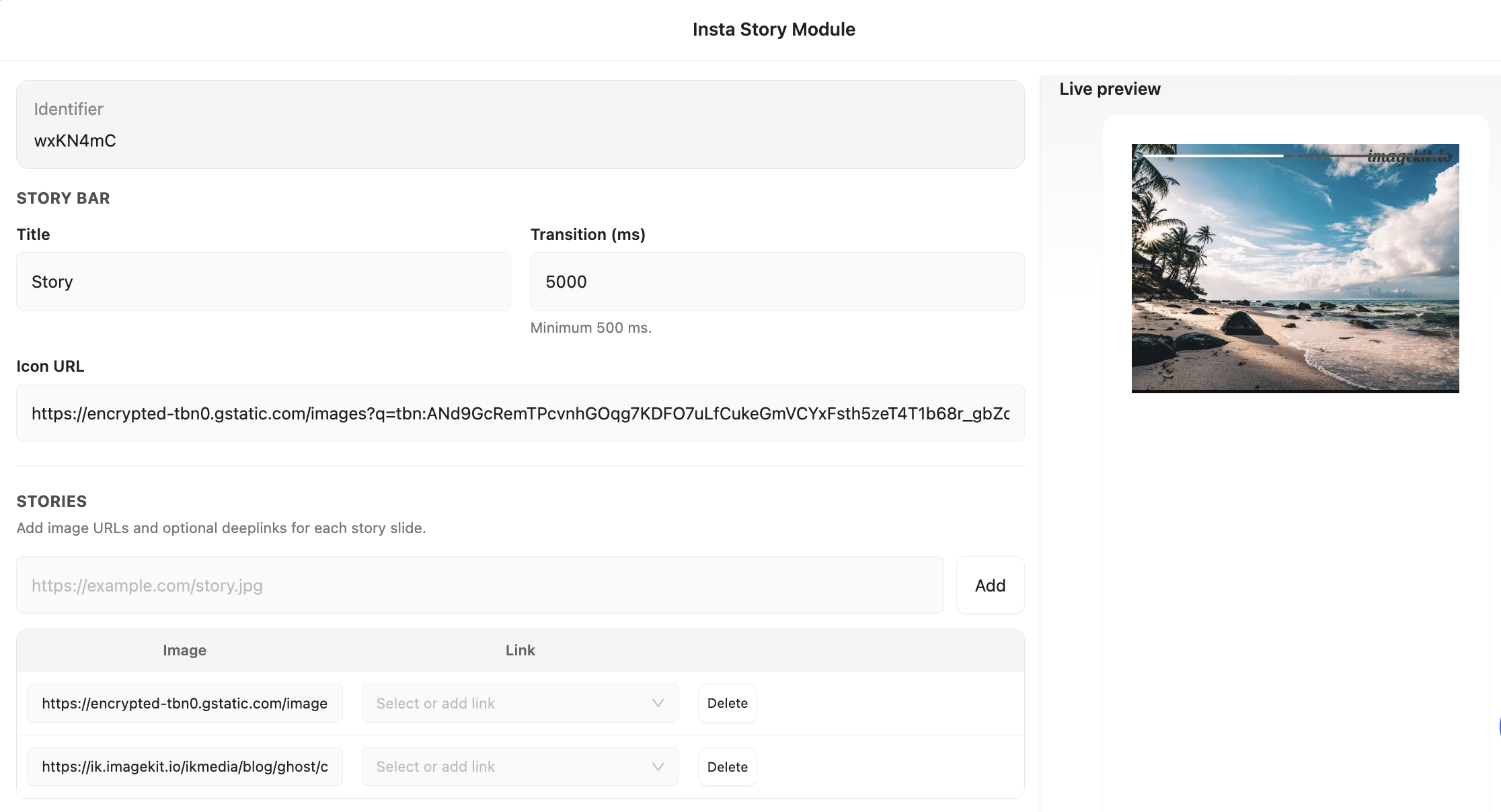
#### Story

Story presents a sequence of images or videos inside the widget. It can be used for product walkthroughs, feature highlights, and short campaign experiences.

Configure the following settings:

* **Title:** Sets the story title.
* **Transition (ms):** Defines how long each slide is displayed before moving to the next one. The minimum value is **500 ms**.
* **Icon URL:** Sets the icon displayed for the story.
* **Image:** Enter the image URL for each story slide.
* **Link:** Optionally add a link to make a story slide clickable.

Keep each story item focused on one message. Increase the duration when users need more time to read or understand the content. Use clear titles and icons to help users understand the sequence.

<figure><img src="https://1642824329-files.gitbook.io/~/files/v0/b/gitbook-x-prod.appspot.com/o/spaces%2FX6uilbEAw42gqsudlclY%2Fuploads%2FhWJGpT2ICAcZzLJksk8T%2FEkran%20Resmi%202026-08-13%2013.48.41.png?alt=media&amp;token=6021b28a-052d-4d49-9567-4c5c52900e29" alt=""><figcaption></figcaption></figure>

### Collect User Information

Use form elements when users need to provide structured information or written responses.

#### Input

Input collects short user information such as names, email addresses, phone numbers, passwords, dates, and other text. Configure the input type, placeholder, required state, and validation rules.

<figure><img src="https://1642824329-files.gitbook.io/~/files/v0/b/gitbook-x-prod.appspot.com/o/spaces%2FX6uilbEAw42gqsudlclY%2Fuploads%2FiLdmH7v58mIFpsD4PRGI%2FEkran%20Resmi%202026-08-13%2013.50.48.png?alt=media&amp;token=1794c82f-3bc2-4bf4-9cba-482d75d2c264" alt="" width="357"><figcaption></figcaption></figure>

Choose the input type according to the expected response. The selected type can affect both keyboard behavior and validation.

<div><figure><img src="https://1642824329-files.gitbook.io/~/files/v0/b/gitbook-x-prod.appspot.com/o/spaces%2FX6uilbEAw42gqsudlclY%2Fuploads%2F7vC0sU0rKC2qIdnuQ2Sj%2FEkran%20Resmi%202026-08-13%2013.51.09.png?alt=media&amp;token=1a25472f-af0f-4797-9d32-b8fee7c63ebc" alt=""><figcaption></figcaption></figure> <figure><img src="https://1642824329-files.gitbook.io/~/files/v0/b/gitbook-x-prod.appspot.com/o/spaces%2FX6uilbEAw42gqsudlclY%2Fuploads%2F1WXsF4eT9xZE2fY4BhMJ%2FEkran%20Resmi%202026-08-13%2013.51.22.png?alt=media&amp;token=37a86514-3574-4c1d-893f-88e2680d4b39" alt=""><figcaption></figcaption></figure></div>

<table><thead><tr><th width="138.47265625">Input type</th><th>Behavior</th></tr></thead><tbody><tr><td>Date</td><td>Accepts <code>DD/MM/YYYY</code> and rejects invalid calendar dates.</td></tr><tr><td>Email</td><td>Validates the entered value as the user types.</td></tr><tr><td>Password</td><td>Masks the entered value.</td></tr><tr><td>Phone</td><td>Opens the numeric keyboard on mobile devices.</td></tr><tr><td>Text</td><td>Accepts general text input.</td></tr></tbody></table>

A required field must contain a valid value before the related submission action can continue.

#### Text Area

Text Area is used for longer written responses such as comments, open-ended feedback, and support requests.

Configure the placeholder, size, font, and color.

Use a sufficiently large field for comfortable typing. The placeholder should explain what type of response is expected. Add validation when a response is required.

<figure><img src="https://1642824329-files.gitbook.io/~/files/v0/b/gitbook-x-prod.appspot.com/o/spaces%2FX6uilbEAw42gqsudlclY%2Fuploads%2Fg90IAuPXPEbvxhb2PvTw%2FEkran%20Resmi%202026-08-13%2013.54.15.png?alt=media&amp;token=aeded0ae-3e38-46cc-b01a-c7a880eab9a4" alt="" width="563"><figcaption></figcaption></figure>

#### Radio Button

Radio Button allows users to select **one option** from a set of choices. It is suitable for yes/no questions, single-choice surveys, and preference selection.

Configure the labels, spacing, and identifier-based conditions.

Keep the number of options small and make each label understandable without additional explanation. Assign an identifier when subsequent actions or conditions depend on the selected value.

<figure><img src="https://1642824329-files.gitbook.io/~/files/v0/b/gitbook-x-prod.appspot.com/o/spaces%2FX6uilbEAw42gqsudlclY%2Fuploads%2FGRMk6t2QSPN7UQHION6P%2FEkran%20Resmi%202026-08-13%2013.55.05.png?alt=media&amp;token=92511d35-840b-48b7-8c51-3bde50b0fff9" alt="" width="563"><figcaption></figcaption></figure>

#### Checkbox

Checkbox allows users to select **multiple options**. It can be used for consent choices, feature preferences, and multi-select questions.

Configure the labels, spacing, and identifier-based conditions.

Use checkboxes only when more than one answer can be valid. Keep labels consistent and configure conditions when subsequent button behavior depends on the selected options.

<figure><img src="https://1642824329-files.gitbook.io/~/files/v0/b/gitbook-x-prod.appspot.com/o/spaces%2FX6uilbEAw42gqsudlclY%2Fuploads%2FBjZ5cJmuKvsGhbhZojUh%2FEkran%20Resmi%202026-08-13%2013.55.31.png?alt=media&amp;token=30880b42-d00a-4b71-aba2-6c47bdbf2a27" alt="" width="563"><figcaption></figcaption></figure>

#### Select Box

Select Box provides a compact way to display a longer list of options, such as countries, categories, branches, or other predefined values.

Configure the option labels and values, dropdown styling, and tracked values.

Use user-friendly labels for the options and consistent tracked values for reporting. For a small number of choices, Radio Button or Button Group can provide a more direct experience.

<figure><img src="https://1642824329-files.gitbook.io/~/files/v0/b/gitbook-x-prod.appspot.com/o/spaces%2FX6uilbEAw42gqsudlclY%2Fuploads%2FNxTcNwP1ZUcBJyl4umJl%2FEkran%20Resmi%202026-08-13%2013.56.50.png?alt=media&amp;token=41e2d95c-c010-4d39-9826-976501d0805d" alt="" width="563"><figcaption></figcaption></figure>

#### Button Group

Button Group presents multiple choices as visually prominent buttons. It is suitable for compact single-choice interactions such as **Yes / No / Maybe**.

Configure the layout, spacing, text, and icons.

Keep the number of options low and use short labels. Leave sufficient space between buttons to prevent accidental taps on mobile devices.

<figure><img src="https://1642824329-files.gitbook.io/~/files/v0/b/gitbook-x-prod.appspot.com/o/spaces%2FX6uilbEAw42gqsudlclY%2Fuploads%2FLJtELslU0ZpkCcfP0wGP%2FEkran%20Resmi%202026-08-13%2013.57.25.png?alt=media&amp;token=eb70e7a4-a812-4892-8ea0-b90ffa7a98e7" alt="" width="563"><figcaption></figcaption></figure>

### Capture Feedback

Use feedback elements to collect ratings, scores, sentiment, and open responses.

#### Rating

Rating collects quick star-based feedback and can be used for satisfaction prompts, reviews, and simple sentiment surveys.

Configure the number of stars, appearance, and scale range.

Pair the rating with a short question that clearly explains what users are evaluating. Rating can also be used as the first step of a feedback flow, where different actions are triggered according to the selected score.

<figure><img src="https://1642824329-files.gitbook.io/~/files/v0/b/gitbook-x-prod.appspot.com/o/spaces%2FX6uilbEAw42gqsudlclY%2Fuploads%2FSpDKts5S1Q0KWOmPBXWN%2FEkran%20Resmi%202026-08-13%2014.02.24.png?alt=media&amp;token=f375cb7e-42ce-4363-8ac7-ed3bb6fb71fb" alt="" width="563"><figcaption></figcaption></figure>

<figure><img src="https://1642824329-files.gitbook.io/~/files/v0/b/gitbook-x-prod.appspot.com/o/spaces%2FX6uilbEAw42gqsudlclY%2Fuploads%2F820oTsTXiyl17hv3ImH3%2FEkran%20Resmi%202026-08-13%2014.02.40.png?alt=media&amp;token=c18271e3-a162-41ef-ad6a-5511271fde13" alt="" width="364"><figcaption></figcaption></figure>

#### Score Rating

Use **Score Rating** to collect numeric feedback, such as satisfaction scores, NPS-style ratings, or post-interaction surveys.

Configure the following settings:

* **Title:** Add the question or heading displayed above the rating.
* **Description:** Add supporting information or instructions.
* **Rating Scale:** Set the minimum and maximum values, default selection, selected-state colors, and click animation.
* **Rating Appearance:** Configure the font, size, background, text, and border styles for unselected rating options.
* **Hover Effects:** Define the background, text, and border styles shown when users hover over a rating option.
* **Labels & Submit Button:** Configure labels such as liked/disliked text, info tag styling, and the submit button text and appearance.
* **Success Message:** Define the title and description displayed after the rating is submitted.

<figure><img src="https://1642824329-files.gitbook.io/~/files/v0/b/gitbook-x-prod.appspot.com/o/spaces%2FX6uilbEAw42gqsudlclY%2Fuploads%2FMg5F207BEhBAuzIwMCwJ%2FEkran%20Resmi%202026-08-13%2014.04.21.png?alt=media&amp;token=a53a48be-f3dc-46ff-b124-a76661cc8910" alt=""><figcaption></figcaption></figure>

Use the **minimum and maximum** values to define the rating range. Set a **default selection** when a preselected value is appropriate. Use the selected and hover states to clearly distinguish interactive and selected options.

<figure><img src="https://1642824329-files.gitbook.io/~/files/v0/b/gitbook-x-prod.appspot.com/o/spaces%2FX6uilbEAw42gqsudlclY%2Fuploads%2FBOudbocW0NhhMY6uNqMz%2FEkran%20Resmi%202026-08-13%2014.05.58.png?alt=media&amp;token=7ac6402d-9e1f-4a1b-937a-de04fa0cc794" alt="" width="563"><figcaption></figcaption></figure>

#### Slider Feedback

Slider Feedback allows users to provide a value along a continuous scale. It is suitable for sentiment, intensity, preference, and similar measurements.

Configure the appearance, text, spacing, and layout.

Use a clear question and make both ends of the scale understandable. Leave sufficient space around the slider, particularly when the widget is used on mobile devices.

<div><figure><img src="https://1642824329-files.gitbook.io/~/files/v0/b/gitbook-x-prod.appspot.com/o/spaces%2FX6uilbEAw42gqsudlclY%2Fuploads%2FIWn1O7gyI6A8j2mW2I7K%2FEkran%20Resmi%202026-08-13%2014.07.40.png?alt=media&amp;token=7c791367-99a9-4335-908c-7deece3630a3" alt=""><figcaption></figcaption></figure> <figure><img src="https://1642824329-files.gitbook.io/~/files/v0/b/gitbook-x-prod.appspot.com/o/spaces%2FX6uilbEAw42gqsudlclY%2Fuploads%2FtB3y4rxDKZ8GOS05hjzb%2FEkran%20Resmi%202026-08-13%2014.08.07.png?alt=media&amp;token=fd880df8-5467-4c29-8412-2ecfb7791c8e" alt=""><figcaption></figcaption></figure></div>

#### Emoji Feedback

Emoji Feedback provides a lightweight way to capture sentiment, particularly in mobile-first experiences and casual surveys.

Configure the emoji set, size, spacing, and optional labels.

<figure><img src="https://1642824329-files.gitbook.io/~/files/v0/b/gitbook-x-prod.appspot.com/o/spaces%2FX6uilbEAw42gqsudlclY%2Fuploads%2FAuljZDuVYP6vWM2pdMyf%2FEkran%20Resmi%202026-08-13%2014.13.02.png?alt=media&amp;token=2c488502-75eb-4e76-9abe-1daf0476156f" alt="" width="563"><figcaption></figcaption></figure>

* **Emoji Type:** Select the emojis displayed in the feedback scale.
* **Show Labels:** Enable labels to provide additional context for the emoji scale.
* **Left Label:** Define the label shown at the beginning of the scale.
* **Right Label:** Define the label shown at the end of the scale.
* **Emojis:** Configure the emojis displayed in each position. Click an emoji slot to open the picker and select an emoji from the available Unicode categories.

The selected emojis can represent different levels of sentiment, for example from negative to positive. Use labels when the meaning of the scale is not immediately clear.

<figure><img src="https://1642824329-files.gitbook.io/~/files/v0/b/gitbook-x-prod.appspot.com/o/spaces%2FX6uilbEAw42gqsudlclY%2Fuploads%2FtXGKRh9qcKsF8hvJT9bI%2FEkran%20Resmi%202026-08-13%2014.09.01.png?alt=media&amp;token=d711f16b-804c-43ac-9bdc-f115256bd1ed" alt=""><figcaption></figcaption></figure>

> **Note:** Unicode emojis are rendered using the device's native emoji set. Their appearance may therefore vary across iOS, Android, Windows, and other platforms.

<figure><img src="https://1642824329-files.gitbook.io/~/files/v0/b/gitbook-x-prod.appspot.com/o/spaces%2FX6uilbEAw42gqsudlclY%2Fuploads%2FLwxjqu3ixV6UBYdMYvBi%2FEkran%20Resmi%202026-08-13%2014.08.44.png?alt=media&amp;token=af08cb19-bddd-417b-80ab-ba78c0c2dd1e" alt=""><figcaption></figcaption></figure>

#### Q\&A

Q\&A can be used for guided help, interactive FAQs, and conversational support flows.

Configure the layout, text formatting, and answer structure.

Keep questions short and use formatting to clearly distinguish questions from answers. Avoid placing too many Q\&A blocks in a single widget.

<figure><img src="https://1642824329-files.gitbook.io/~/files/v0/b/gitbook-x-prod.appspot.com/o/spaces%2FX6uilbEAw42gqsudlclY%2Fuploads%2F6VVqH6ajDmWTuJKoutyB%2FEkran%20Resmi%202026-08-13%2014.15.59.png?alt=media&amp;token=b61881cc-b4b9-4342-996d-b36826521952" alt=""><figcaption></figcaption></figure>

<figure><img src="https://1642824329-files.gitbook.io/~/files/v0/b/gitbook-x-prod.appspot.com/o/spaces%2FX6uilbEAw42gqsudlclY%2Fuploads%2FVKTd8aiZ4U4XCvvrSalN%2FEkran%20Resmi%202026-08-13%2014.15.45.png?alt=media&amp;token=8e37c36b-352b-4004-a7f0-a18c8d72fce0" alt="" width="563"><figcaption></figcaption></figure>

### Offer Rewards and Gamification

Use promotional elements to create reward-focused experiences, time-limited offers, and gamified campaigns.

#### Copy Button

Copy Button is designed for coupon campaigns and reveal-and-copy experiences.

Configure:

* Visible or hidden mode
* Reveal text
* Copied message
* Color
* Border radius
* Coupon list

Coupon lists are managed under **Coupon Code Lists**.

<figure><img src="https://1642824329-files.gitbook.io/~/files/v0/b/gitbook-x-prod.appspot.com/o/spaces%2FX6uilbEAw42gqsudlclY%2Fuploads%2FOpWxferBJ8qe0HmPCTOS%2FEkran%20Resmi%202026-08-13%2013.59.29.png?alt=media&amp;token=4838f755-c2c7-4e4f-bb3d-1032c016b5fd" alt=""><figcaption></figcaption></figure>

**Coupon display modes**

**Visible** mode displays the coupon code immediately.

**Hidden** mode keeps the code hidden until the user interacts with the button. The configured reveal text is displayed before the code is revealed.

<figure><img src="https://1642824329-files.gitbook.io/~/files/v0/b/gitbook-x-prod.appspot.com/o/spaces%2FX6uilbEAw42gqsudlclY%2Fuploads%2FCloCGm3xPplRdWsHjQE1%2FEkran%20Resmi%202026-08-13%2013.59.42.png?alt=media&amp;token=6e9d58d0-eff1-4f67-b9a5-058190cf4e68" alt=""><figcaption></figcaption></figure>

Customize the success message so users know that the coupon has been copied successfully.

**Coupon availability**

Coupon codes can have an expiry date and time. Expired coupons are not displayed to end users.

If all coupons connected to the related campaign have expired, the campaign is considered finished.

<figure><img src="https://1642824329-files.gitbook.io/~/files/v0/b/gitbook-x-prod.appspot.com/o/spaces%2FX6uilbEAw42gqsudlclY%2Fuploads%2Fcimv1YF3ijWro1Xgifnj%2FEkran%20Resmi%202026-08-13%2014.00.04.png?alt=media&amp;token=f716ce47-7d2c-4d3f-badb-3d25f72f50c3" alt=""><figcaption></figcaption></figure>

#### Countdown

Countdown displays the remaining time until a defined date and time. It can be used for flash sales, limited-time offers, launch reminders, and time-based rewards.

<figure><img src="https://1642824329-files.gitbook.io/~/files/v0/b/gitbook-x-prod.appspot.com/o/spaces%2FX6uilbEAw42gqsudlclY%2Fuploads%2F4AKnhmrn8ICduCOvlso2%2FEkran%20Resmi%202026-08-13%2014.00.43.png?alt=media&amp;token=f31209f0-5d96-4928-93f1-d92d897a0984" alt=""><figcaption></figcaption></figure>

Configure:

* Target date and time
* Labels
* Finish text
* Under-five-minutes mode
* Colors

Set the target date first, then customize the labels according to the language and context of the widget. Define a clear finish message for when the countdown reaches zero. Preview both the active and finished states before saving.

<figure><img src="https://1642824329-files.gitbook.io/~/files/v0/b/gitbook-x-prod.appspot.com/o/spaces%2FX6uilbEAw42gqsudlclY%2Fuploads%2F5uVPQlmcBbvltWb3UZ57%2FEkran%20Resmi%202026-08-13%2014.01.01.png?alt=media&amp;token=b4b55ae2-8b88-4f62-81e6-22e8207cb841" alt=""><figcaption></figcaption></figure>

#### Spin to Win

Spin to Win presents a prize wheel that users can spin to receive a defined outcome. It can be used for gamified promotions, rewards, and coupon distribution.

Configure:

Configure these parts of the wheel:

* **Slice names**: labels shown for each reward.
* **Outcome text**: the message shown after a spin.
* **Coupons or links**: the reward delivered for each outcome.
* **Gravity**: the probability assigned to each slice.
* **Out-of-coupon message**: the message shown when rewards are unavailable.
* **Success screen**: the view users see after their result.

Give every slice a clear name and outcome message. Assign a coupon when rewards are redeemable. Assign a link when rewards take users elsewhere.

For campaign setup, publishing, rewards, and reporting, see [Spin to Win campaigns](/netmera-user-guide/omnichannel-engagement/widgets/build-a-widget/spin-to-win-campaigns.md).

<figure><img src="https://1642824329-files.gitbook.io/~/files/v0/b/gitbook-x-prod.appspot.com/o/spaces%2FX6uilbEAw42gqsudlclY%2Fuploads%2FANuIYse3C5W9xkKt3vw9%2FEkran%20Resmi%202026-08-13%2014.16.40.png?alt=media&amp;token=a6453306-1e0a-444d-a5d7-c6aeeb903d15" alt="Spin to Win configuration"><figcaption><p>Configure each wheel slice and its reward.</p></figcaption></figure>

### Complete the Widget

Before saving the widget, review each view and its interactions.

* Check that each view has one clear goal.
* Confirm that only the required elements are included.
* Assign identifiers to interactive elements where they are required for conditions or actions.
* Configure button and image click behavior.
* Configure validation for form inputs.
* Verify coupon and reward settings.
* Preview the widget on both mobile and desktop layouts.
* Check the active and completed states of time-based elements such as Countdown.
* Verify that text, images, buttons, and interactive controls remain readable and usable on smaller screens.

For the editor workflow, see **Design Widget Layout**.

For click actions, navigation, and validation, see **Configure Widget Actions and Validation**.


---

# Agent Instructions
This documentation is published with GitBook. GitBook is the documentation platform designed so that both humans and AI agents can read, navigate, and reason over technical content effectively. Learn more at gitbook.com.

## Querying This Documentation
If you need additional information that is not directly available in this page, you can query the documentation dynamically by asking a question.

Perform an HTTP GET request on the current page URL with the `ask` query parameter, and the optional `goal` query parameter:

```
GET https://user.netmera.com/netmera-user-guide/omnichannel-engagement/widgets/build-a-widget/widget-elements-reference.md?ask=<question>&goal=<endgoal>
```

`ask` is the immediate question: it should be specific, self-contained, and written in natural language.
`goal` is optional and describes the broader end goal you are ultimately trying to accomplish on behalf of the user. GitBook uses it to tailor the answer towards what is most useful for that goal.

The response will contain a direct answer to the question and relevant excerpts and sources from the documentation.

Use this mechanism when the answer is not explicitly present in the current page, you need clarification or additional context, or you want to retrieve related documentation sections.