> For the complete documentation index, see [llms.txt](https://user.netmera.com/netmera-user-guide/llms.txt). Markdown versions of documentation pages are available by appending `.md` to page URLs; this page is available as [Markdown](https://user.netmera.com/netmera-user-guide/omnichannel-engagement/widgets/build-a-widget/configure-widget-actions-and-validation.md).

# Configure widget actions and validation

Configure what happens when users click a widget element.

Use actions to navigate users, collect data, update profiles, or trigger events. Use validation to block incomplete or invalid form submissions.

Build the structure first in [Design widget layout](/netmera-user-guide/omnichannel-engagement/widgets/build-a-widget/design-widget-layout.md). Choose elements in [Widget elements reference](/netmera-user-guide/omnichannel-engagement/widgets/build-a-widget/widget-elements-reference.md).

{% hint style="info" %}
Set clear, stable identifiers before mapping values, conditions, or custom events.
{% endhint %}

### Before you start

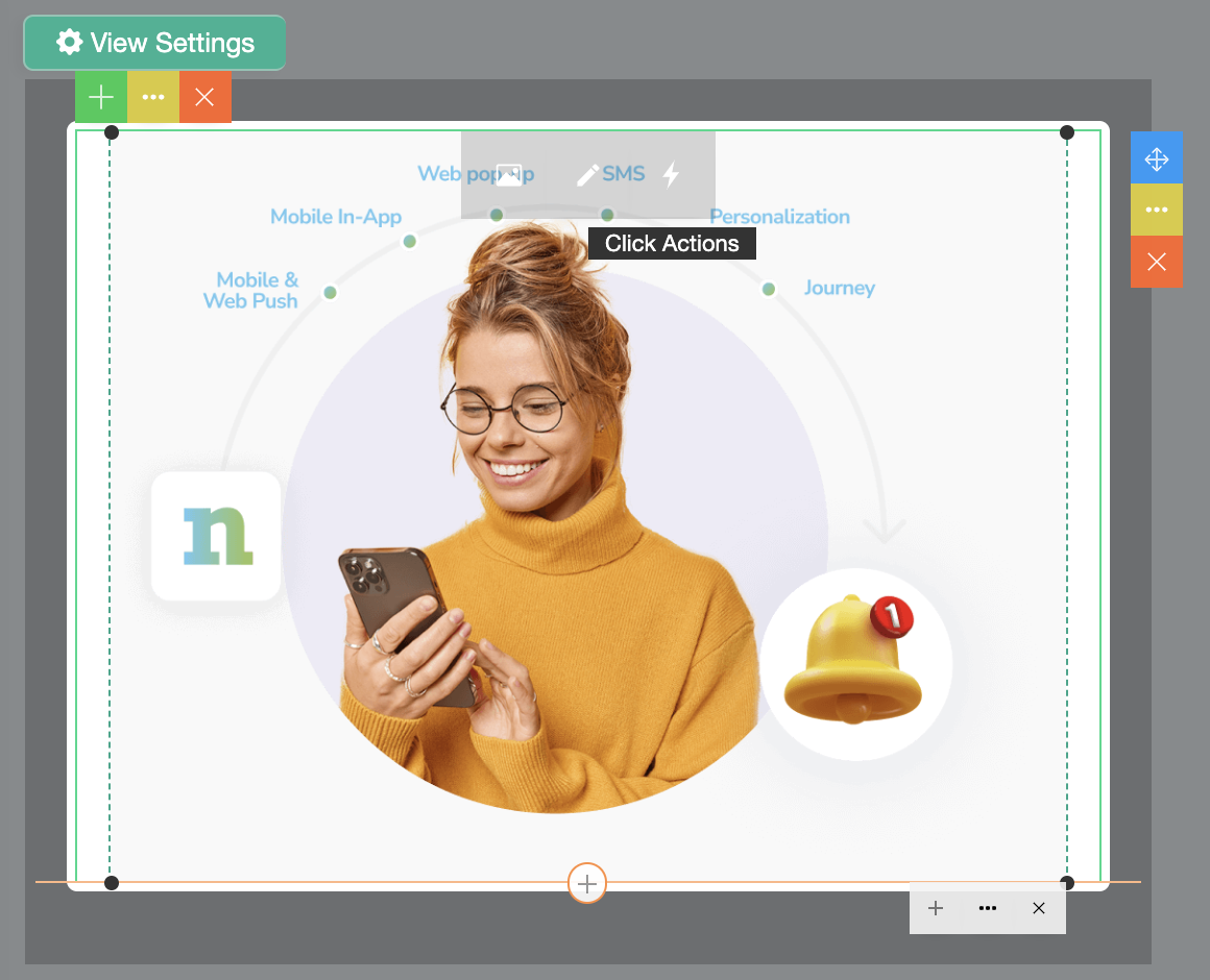
Click actions are available for **Buttons** and **Images**. Set identifiers for every element used in mappings or conditions.

### Configure an action

1. Select a button or image.
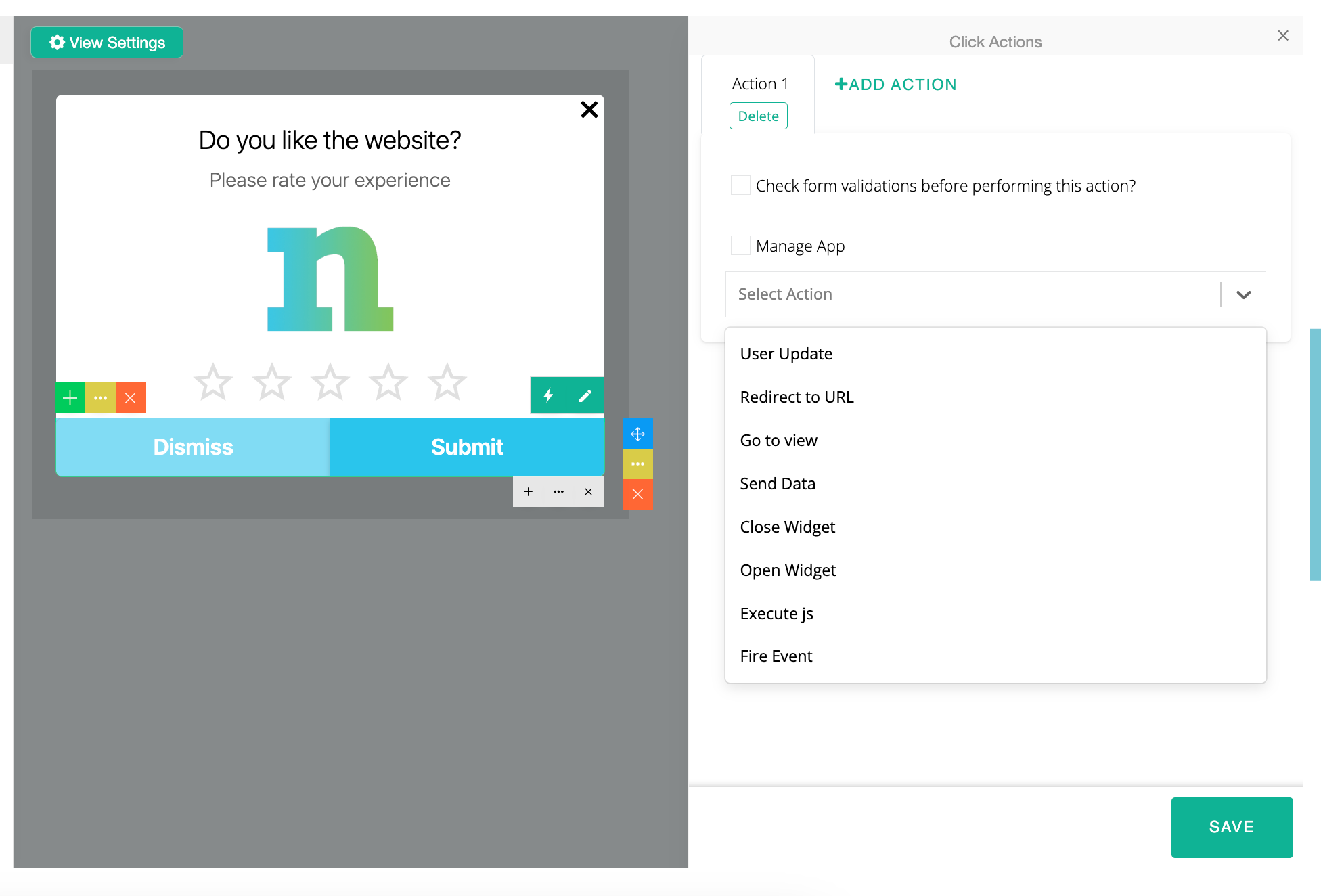
2. Click the ⚡ **lightning** icon in the toolbar.
3. Choose an action.
4. Add conditions or validation when needed.
5. Preview every path before saving.

<figure><img src="/files/cz2zRDHmXpquoHMSNoSW" alt="Click Actions panel" width="375"><figcaption><p>Choose an action for the selected button or image.</p></figcaption></figure>

### Choose an action

Use the action that matches the outcome you need:

* **User Update**: save a profile attribute or form response.
* **Redirect to URL**: open a web page.
* **Go to View**: move to another screen within the widget.
* **Send Data**: send values to an endpoint.
* **Close Widget**: dismiss the current widget.
* **Open Widget**: launch another saved widget.
* **Get Web Push Permission**: request browser notification permission.
* **Fire Event**: record a custom event.
* **Android Background Location Permission**: open Android location permission settings.
* **Deep Link**: open an in-app destination.
* **Manage App**: let your app handle the action result.

### Action types

#### User Update

Use **User Update** when a click should update profile data or user properties.

This is useful for saving form responses, updating user fields, or writing back preference data.

How to set it up:

1. Select the button or image.
2. Choose **User Update**.
3. Pick the field you want to update.
4. Map the value from a widget component if needed.

{% hint style="success" %}

#### Matching components with attributes

To access subcategories of the target profile attribute:

* **Windows:** `CTRL + ALT + 7`
* **Mac:** `FN + Option + 7`
  {% endhint %}

<div><figure><img src="/files/C2aFRAegEyQVvAQVI16N" alt="User Update attribute options" width="375"><figcaption><p>Open attribute subcategories to select the update method.</p></figcaption></figure> <figure><img src="/files/WY9P81I828UqGEAa4ley" alt="User Update action settings" width="375"><figcaption><p>Choose the profile field and its value source.</p></figcaption></figure></div>

**Example**

To update a user’s email through a button:

1. Assign an identifier to the button.
2. Select **User Update**.
3. Open the subcategory and choose the update method.
4. Select **Content** if the value comes from another widget component.
5. Match the content with the component you want to use, such as `emailattributebutton`.

<figure><img src="/files/aMzV2rc4kU3bOIL2qp16" alt="Mapping a widget component to a profile attribute" width="375"><figcaption><p>Map the value from the relevant widget component.</p></figcaption></figure>

<figure><img src="/files/X7FhVBxoWtP7hUpATqgL" alt="User Update mapping example" width="375"><figcaption><p>Confirm the mapped component before saving.</p></figcaption></figure>

#### Redirect to URL

Use **Redirect to URL** when a click should open a web page.

Best for external websites, landing pages, product pages, and campaign detail pages.

How to set it up:

1. Enter the destination URL.
2. Add a condition if the redirect should run only in a specific case.

<figure><img src="/files/dEojKTCJ2yUIpFbTz4l1" alt="Redirect to URL action settings" width="375"><figcaption><p>Enter the destination and add conditions when required.</p></figcaption></figure>

#### Go to View

Use **Go to View** to move users to another screen inside the same widget.

This is the main action for multi-step flows such as rating → thank you or form → success.

How to set it up:

1. Choose **Go to View**.
2. Select the target view.
3. Add **Action Conditions** if the target should depend on user input.

<div><figure><img src="/files/RaEjaVpIkbmeM5JwUP90" alt="Go to View action" width="375"><figcaption><p>Use this action for navigation inside the widget.</p></figcaption></figure> <figure><img src="/files/RVvVBd9tSnJbFQgkBjvt" alt="Go to View target selection" width="375"><figcaption><p>Select the destination view and optional conditions.</p></figcaption></figure></div>

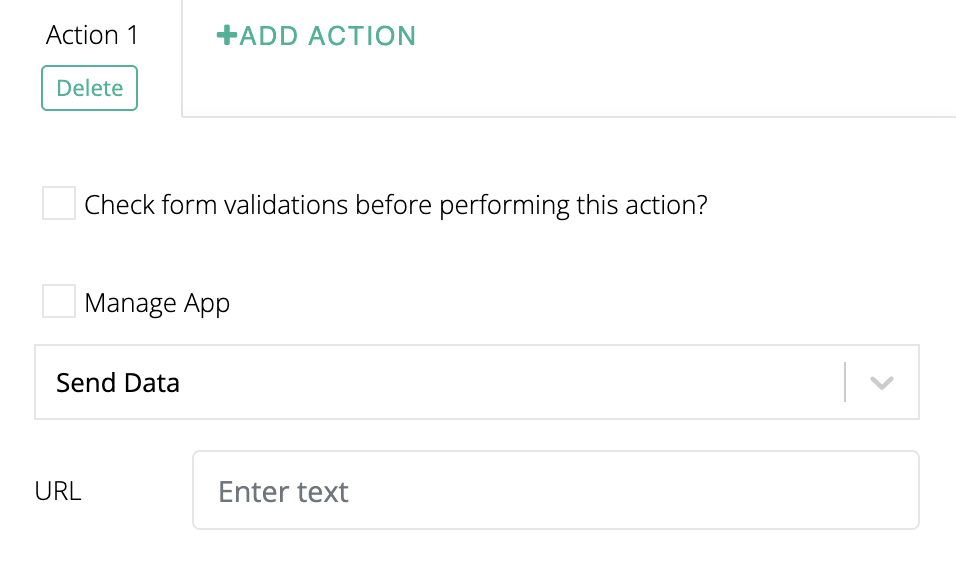
#### Send Data

Use **Send Data** when the click should send form or interaction data to an endpoint.

This is useful for custom data collection and server-side workflows.

How to set it up:

1. Define the data or parameters to send.
2. Enter the endpoint URL.
3. Add conditions if the send action should be limited.

<figure><img src="/files/Bt4Hx0EN0wQNqv4FR71y" alt="Send Data action settings" width="375"><figcaption><p>Configure the endpoint and values to send.</p></figcaption></figure>

#### Close Widget

Use **Close Widget** when the interaction should simply dismiss the widget.

This works well for actions such as `Dismiss`, `Maybe later`, or `No thanks`.

<figure><img src="/files/6plhxPanek1HPX5PEBNV" alt="Close Widget action" width="375"><figcaption><p>Close the widget after the user dismisses it.</p></figcaption></figure>

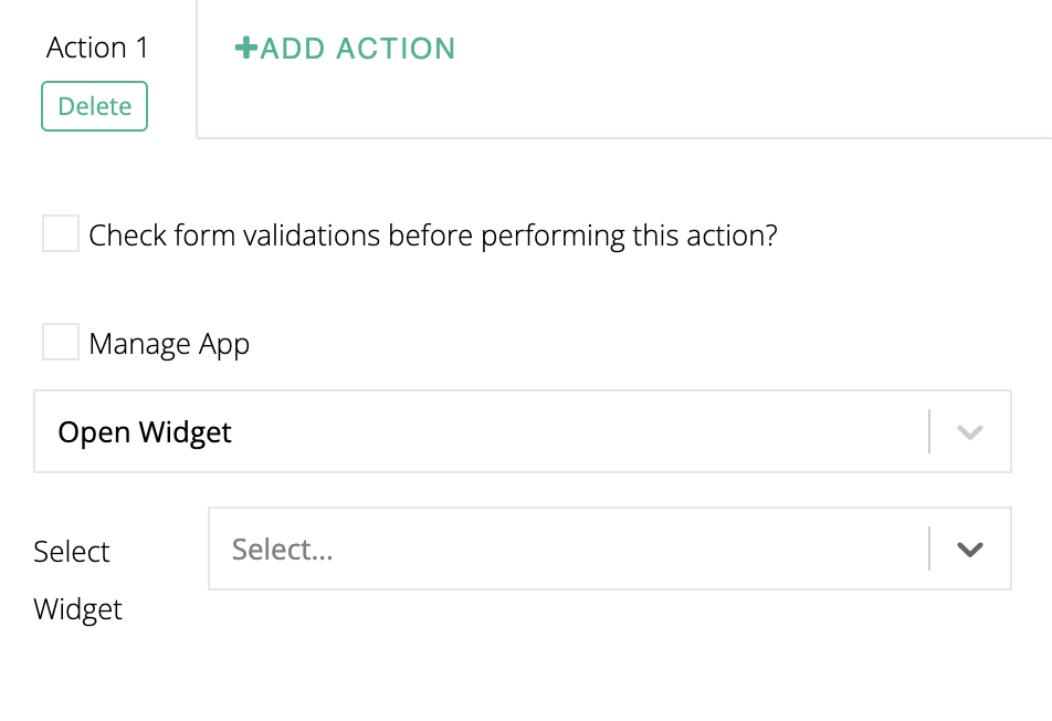
#### Open Widget

Use **Open Widget** when one widget should launch another widget.

This is useful for chained flows such as summary widget → detailed widget.

How to set it up:

1. Choose **Open Widget**.
2. Select the target widget.
3. Make sure the target widget already exists.

<figure><img src="/files/D2wmUojYw8vSk06IZz7h" alt="Open Widget action settings" width="375"><figcaption><p>Select an existing widget to open next.</p></figcaption></figure>

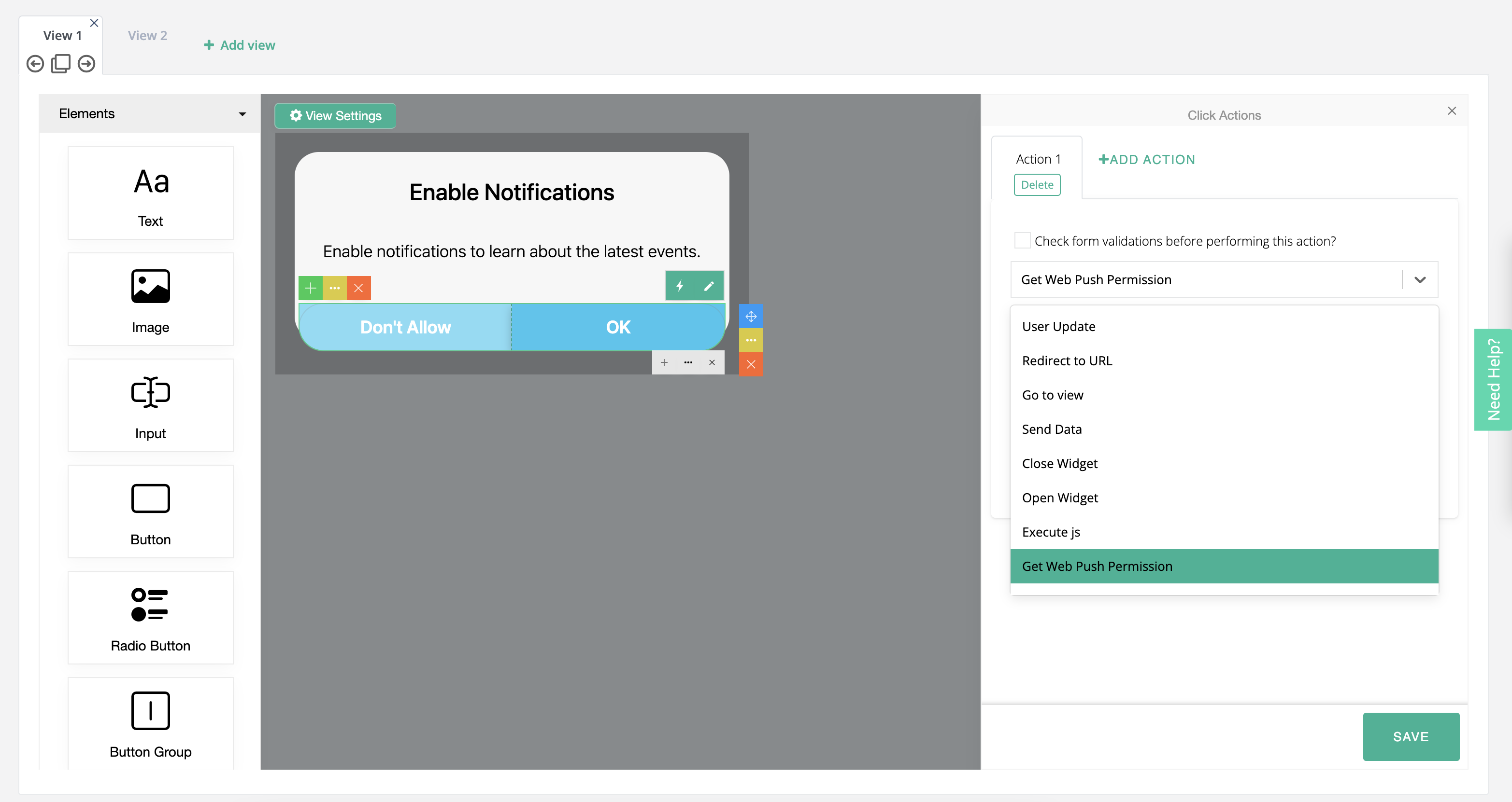
#### Get Web Push Permission

Use **Get Web Push Permission** to request browser notification permission from the user.

This action supports onboarding, subscription prompts, and well-timed opt-in requests.

<figure><img src="/files/qHQZJLRIYNIgv9SetExy" alt="Get Web Push Permission action settings" width="563"><figcaption><p>Assign the permission request to a button or image.</p></figcaption></figure>

When users click the assigned element:

1. The browser displays its native permission prompt.
2. Users choose whether to allow notifications.
3. Their decision is reflected in Netmera automatically.

<div><figure><img src="/files/KgkddkZ4Mnw68Y4opIvA" alt="Widget asking users to enable web push notifications" width="563"><figcaption><p>Explain the value of notifications before requesting permission.</p></figcaption></figure> <figure><img src="/files/a9r6v2Nwg5zdK4taBo1C" alt="Browser notification permission prompt" width="563"><figcaption><p>The browser presents the final permission choice.</p></figcaption></figure></div>

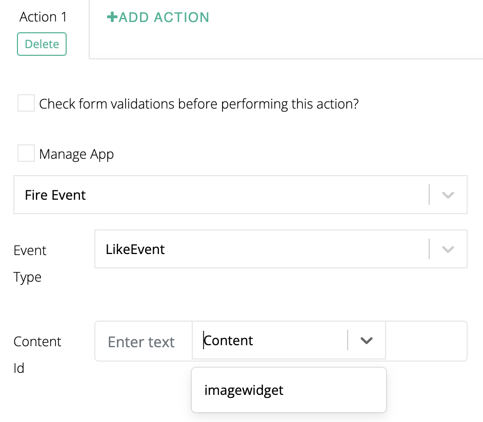
#### Fire Event

Use **Fire Event** when a click should trigger a custom event inside your app or tracking setup.

This is useful when another workflow, report, or integration depends on the interaction.

How to set it up:

1. Create the event first in [Create Custom Events](/netmera-user-guide/panel-settings/settings/app-configuration/events.md).
2. Assign **Fire Event** to the button or image.
3. Select the event from the list.

{% hint style="success" %}

#### Matching widget components with events

To access subcategories:

* **Windows:** `CTRL + ALT + 7`
* **Mac:** `FN + Option + 7`
  {% endhint %}

<div><figure><img src="/files/Myq977BvGDwqVpFopH9K" alt="Fire Event action settings" width="375"><figcaption><p>Select the event to record when users click.</p></figcaption></figure> <figure><img src="/files/xB5p36oT8jxLWsfxUold" alt="Fire Event mapping options" width="375"><figcaption><p>Open event subcategories to configure mapped values.</p></figcaption></figure></div>

**Example**

To fire an event from an image click:

1. Assign an identifier to the image.
2. Select **Fire Event**.
3. Open the subcategory and choose the method.
4. Select **Content** if the mapping comes from a widget component.
5. Match the event with the right component, such as pairing `LikeEvent` with the image identifier.

<div><figure><img src="/files/yBiR45QzohSGBiKsHNi4" alt="Mapping a widget component to a custom event" width="375"><figcaption><p>Use the identifier to map the relevant component.</p></figcaption></figure> <figure><img src="/files/2xNUbP6VJrj8KYeIxVLQ" alt="Fire Event mapping example" width="375"><figcaption><p>Review the event mapping before saving.</p></figcaption></figure></div>

#### Android Background Location Permission

Use this action when the widget should guide Android users to allow or deny background location access.

<div><figure><img src="/files/4ULB3rIL8LLiyWHcCfTU" alt="Android background location permission action"><figcaption><p>Use this action only for Android mobile widgets.</p></figcaption></figure> <figure><img src="/files/nvGiiWd2EIJvWf2GqCSP" alt="Android background location permission settings" width="563"><figcaption><p>Assign the appropriate permission action to each button.</p></figcaption></figure></div>

How to set it up:

1. Add buttons such as **Allow Permission** and **Deny Permission**.
2. Assign the matching background location action to each button.
3. After the click, the user is directed to the Android **Settings** screen.

#### Deep Link

Use **Deep Link** when the click should open a specific destination inside the app.

This is useful for product pages, article detail pages, feature screens, or campaign destinations.

<figure><img src="/files/6kYqgbaZ3j9noJV7BOQ1" alt="Deep Link action settings" width="375"><figcaption><p>Enter the in-app destination for the selected platform.</p></figcaption></figure>

#### Manage App

Use **Manage App** when the app should handle the action itself.

This action is commonly used for app-level deep link behavior.

<figure><img src="/files/UPHiLXQK9CNDS07adi3D" alt="Manage App action settings" width="375"><figcaption><p>Use this action when your app handles the result.</p></figcaption></figure>

### Validations

Validations prevent incomplete or invalid input before an action runs.

Set an input type first. Then add the rules and error messages users need.

<figure><img src="/files/Cn5xHRxiHUatgXJUWosB" alt="Validation settings for a widget field" width="375"><figcaption><p>Configure validation on the field that collects user input.</p></figcaption></figure>

#### Input types

The input type controls how users enter a value and which checks apply automatically. Choose the type that matches the expected data, then add validation rules for any additional requirements.

<table><thead><tr><th width="129.09375">Input type</th><th width="338.203125">Behavior</th><th>Use it for</th></tr></thead><tbody><tr><td><strong>Text</strong></td><td>Supports required, length, and regex rules.</td><td>Names, labels, and formatted text values.</td></tr><tr><td><strong>Number</strong></td><td>Supports numeric ranges and percentage constraints.</td><td>Quantities, ages, and scores.</td></tr><tr><td><strong>Date</strong></td><td>Shows <code>DD/MM/YYYY</code> and a calendar picker. Blocks invalid dates and formats.</td><td>Registrations, reservations, and appointments.</td></tr><tr><td><strong>Email</strong></td><td>Checks standard email formatting as users type. Blocks submission until corrected.</td><td>Sign-up and contact forms.</td></tr><tr><td><strong>Phone</strong></td><td>Shows a telephone keyboard on mobile. It does not enforce a format.</td><td>Phone number collection. Use <strong>Regex</strong> for country codes or digit counts.</td></tr><tr><td><strong>Password</strong></td><td>Masks entered characters. It does not enforce complexity rules.</td><td>Password creation or confirmation. Use <strong>Regex</strong> for requirements.</td></tr><tr><td><strong>URL</strong></td><td>Checks standard URL formatting. Blocks submission for invalid values.</td><td>Websites, deep links, and other URL values.</td></tr></tbody></table>

<figure><img src="/files/T8GMoscCdd1rEeUQoG57" alt="Input type selection for validation" width="375"><figcaption><p>Choose the input type that matches the value users enter.</p></figcaption></figure>

#### Validation rules

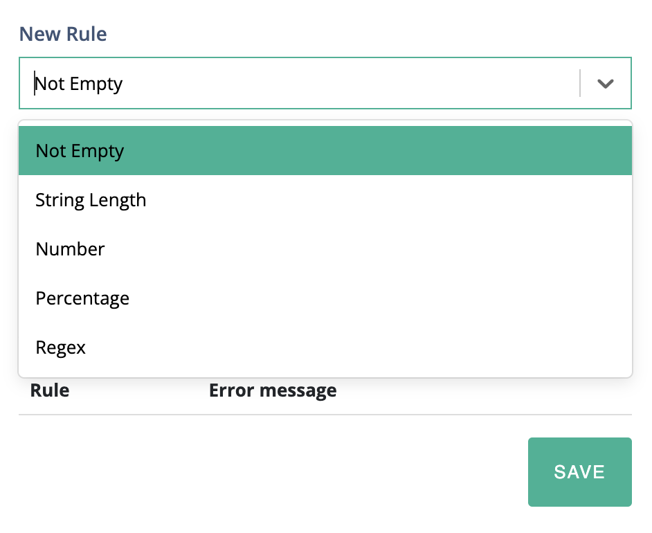
Validation rules define the specific condition a field value must meet before the form can be submitted. Each rule requires an error message that is shown to the user when the condition is not met.

<figure><img src="/files/FnPchrMkttvOWWcVN3XH" alt="Validation rule settings" width="375"><figcaption><p>Add a rule and write the error message users see.</p></figcaption></figure>

<table><thead><tr><th width="154.6861572265625">Rule</th><th>Description</th></tr></thead><tbody><tr><td><strong>Not Empty</strong></td><td>Ensures the field is not left blank. Use for any required field.</td></tr><tr><td><strong>String Length</strong></td><td>Enforces a minimum and/or maximum character count on text input.</td></tr><tr><td><strong>Number</strong></td><td>Validates that the entered value falls within a defined numeric range.</td></tr><tr><td><strong>Percentage</strong></td><td>Validates that the value is a valid percentage (0–100).</td></tr><tr><td><strong>Regex</strong></td><td>Validates the value against a custom regular expression pattern. Use for formats not covered by built-in types, such as national ID numbers, postal codes, or phone number patterns.</td></tr><tr><td><strong>Valid Date</strong></td><td>Ensures the entered date is a real, calendar-valid date. Blocks submission if the value is an impossible date such as <code>31/02/2025</code>.</td></tr><tr><td><strong>Date - Minimum</strong></td><td>Requires the entered date to be on or after a specified date. Use for scenarios where past dates are not acceptable, such as future appointment scheduling.</td></tr><tr><td><strong>Date - Maximum</strong></td><td>Requires the entered date to be on or before a specified date. Use for scenarios where future dates are not acceptable, such as birth date fields.</td></tr><tr><td><strong>Email</strong></td><td>Validates that the entered value matches standard email address format. Blocks submission if the value is missing an <code>@</code> sign or domain.</td></tr></tbody></table>

#### Run validation before the action

Enable **Check Form Validations Before Performing This Action** on the form action.

The widget checks validation first. Passing values run the action. Failed values show the related error and block the action.

{% hint style="warning" %}

#### Important step

Do not forget **Check Form Validations Before Performing This Action**. This ensures that all validation rules run before the click action is executed.
{% endhint %}

<figure><img src="/files/sb4gLMLt5CUmvwPLZQfj" alt="Check Form Validations Before Performing This Action setting" width="375"><figcaption><p>Enable this setting on the action that submits the form.</p></figcaption></figure>

### Action Conditions

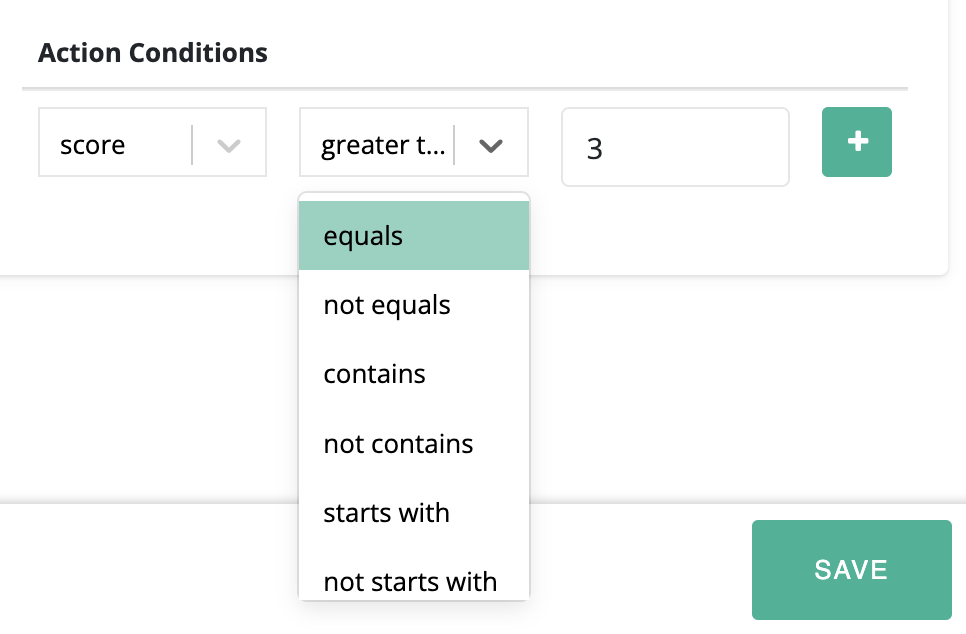
Use **Action Conditions** to run an action only for a matching user choice or value. Each condition evaluates an element identifier against an expected value.

1. Choose the identifier to evaluate.
2. Select the condition.
3. Enter the expected value.
4. Save the action.

{% columns %}
{% column %}

<figure><img src="/files/c3pf4ybhGrekENiaW8T3" alt="Action Conditions settings"><figcaption><p>Select the identifier, condition, and expected value.</p></figcaption></figure>
{% endcolumn %}

{% column %}

<figure><img src="/files/idi4VdHoSjaqNaDL2WQ5" alt="Configured action condition" width="375"><figcaption><p>The action runs only when the condition matches.</p></figcaption></figure>
{% endcolumn %}
{% endcolumns %}

### Example: route users by rating

This flow asks users for a five-star rating. Ratings of **1 to 3** open **Feedback**. Ratings of **4 to 5** open **Thank You**.

#### Build the views

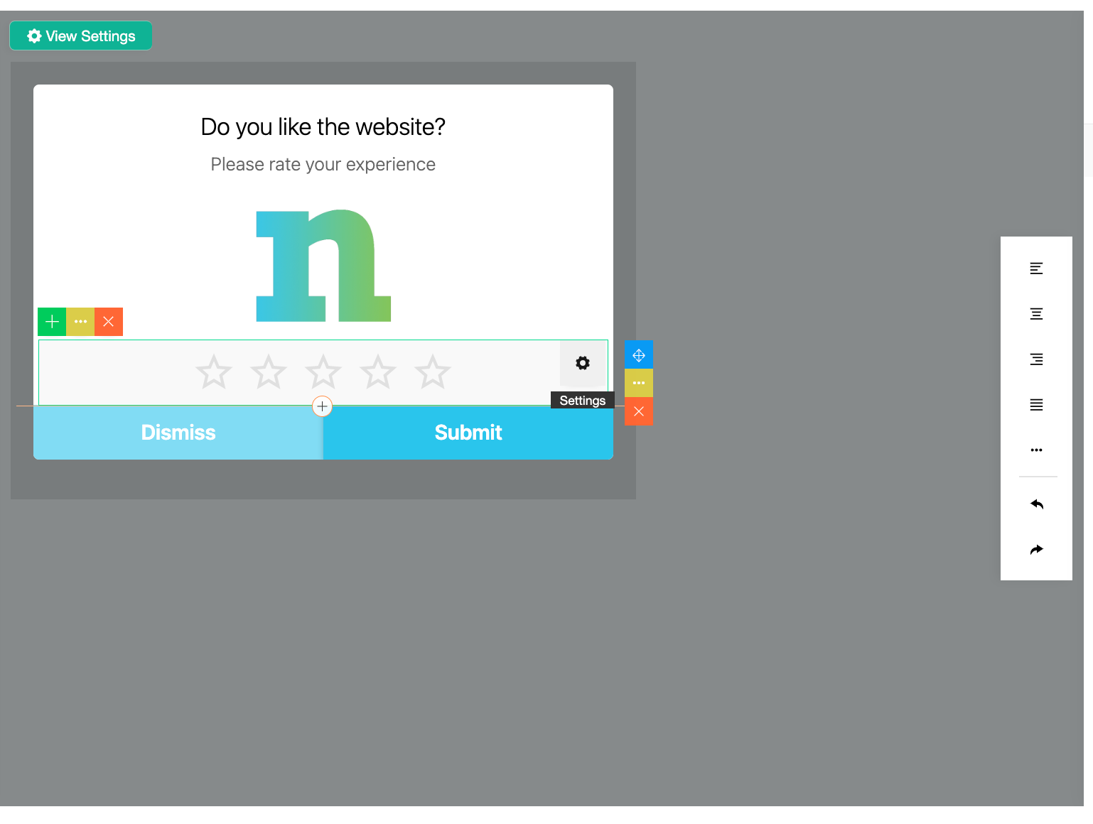
1. Add a rating element and a submit button to the first view.
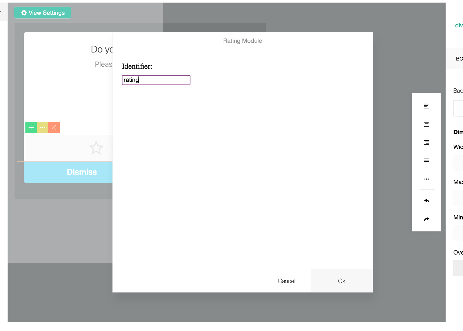
2. Set the rating element identifier to `rating`.
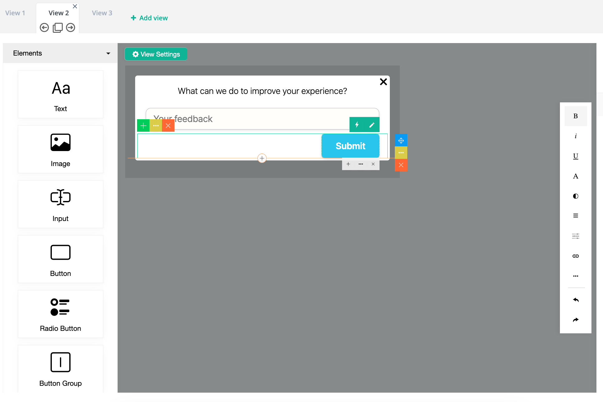
3. Add **View 2** for **Feedback**.
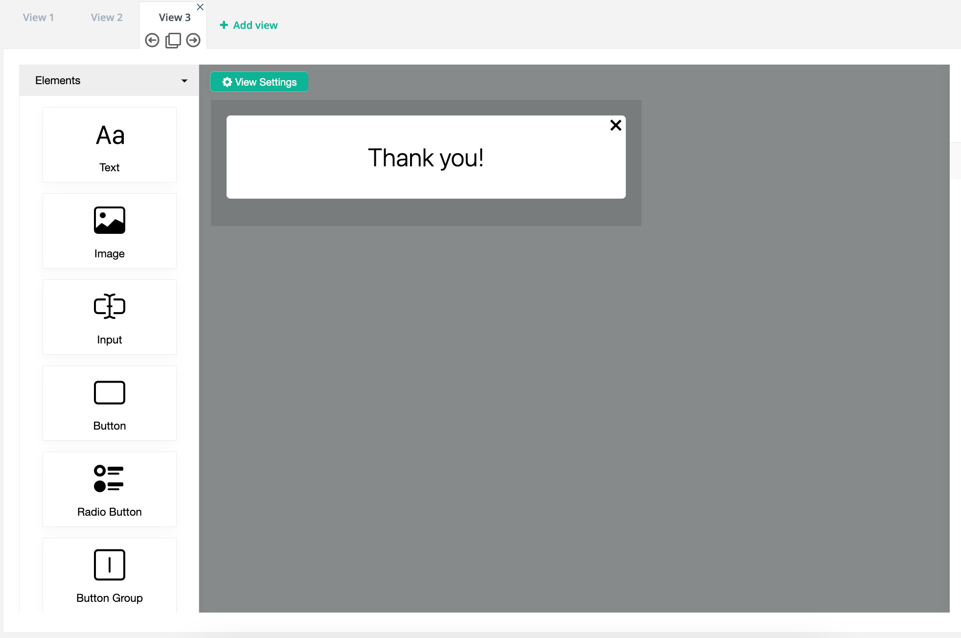
4. Add **View 3** for **Thank You**.

Identifiers appear at the top-right of the selected element. Replace generated names before configuring actions.

{% columns %}
{% column %}

<figure><img src="/files/mFELx7b4p0RGbjch73Jx" alt="Rating element identifier" width="563"><figcaption><p>Assign a clear identifier to the rating element.</p></figcaption></figure>

<figure><img src="/files/nAYtGMfMQVbOykisxk3i" alt="Feedback view in the rating flow" width="563"><figcaption><p>View 2 collects feedback from lower ratings.</p></figcaption></figure>
{% endcolumn %}

{% column %}

<figure><img src="/files/6o3XETzuq56Agm6vrBBw" alt="Identifier field in element settings" width="563"><figcaption><p>Use the identifier in the button action conditions.</p></figcaption></figure>

<figure><img src="/files/tT2SE1pJs5GmZEKh9iVT" alt="Thank You view in the rating flow" width="563"><figcaption><p>View 3 thanks users with higher ratings.</p></figcaption></figure>
{% endcolumn %}
{% endcolumns %}

#### Configure the outcomes

Add two **Go to View** actions to the submit button:

| Action         | Target view           | Condition     |
| -------------- | --------------------- | ------------- |
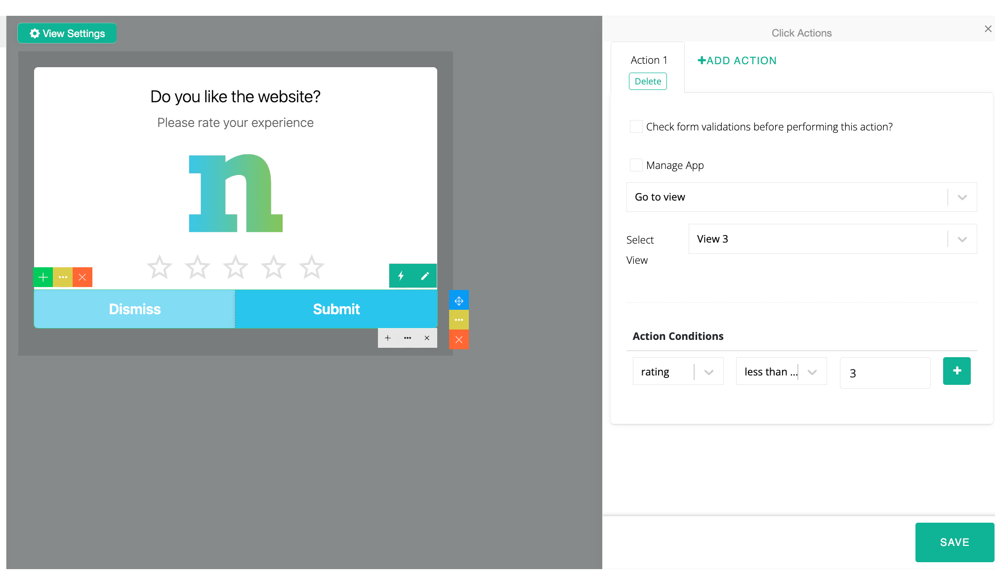
| **Go to View** | **View 2: Feedback**  | `rating <= 3` |
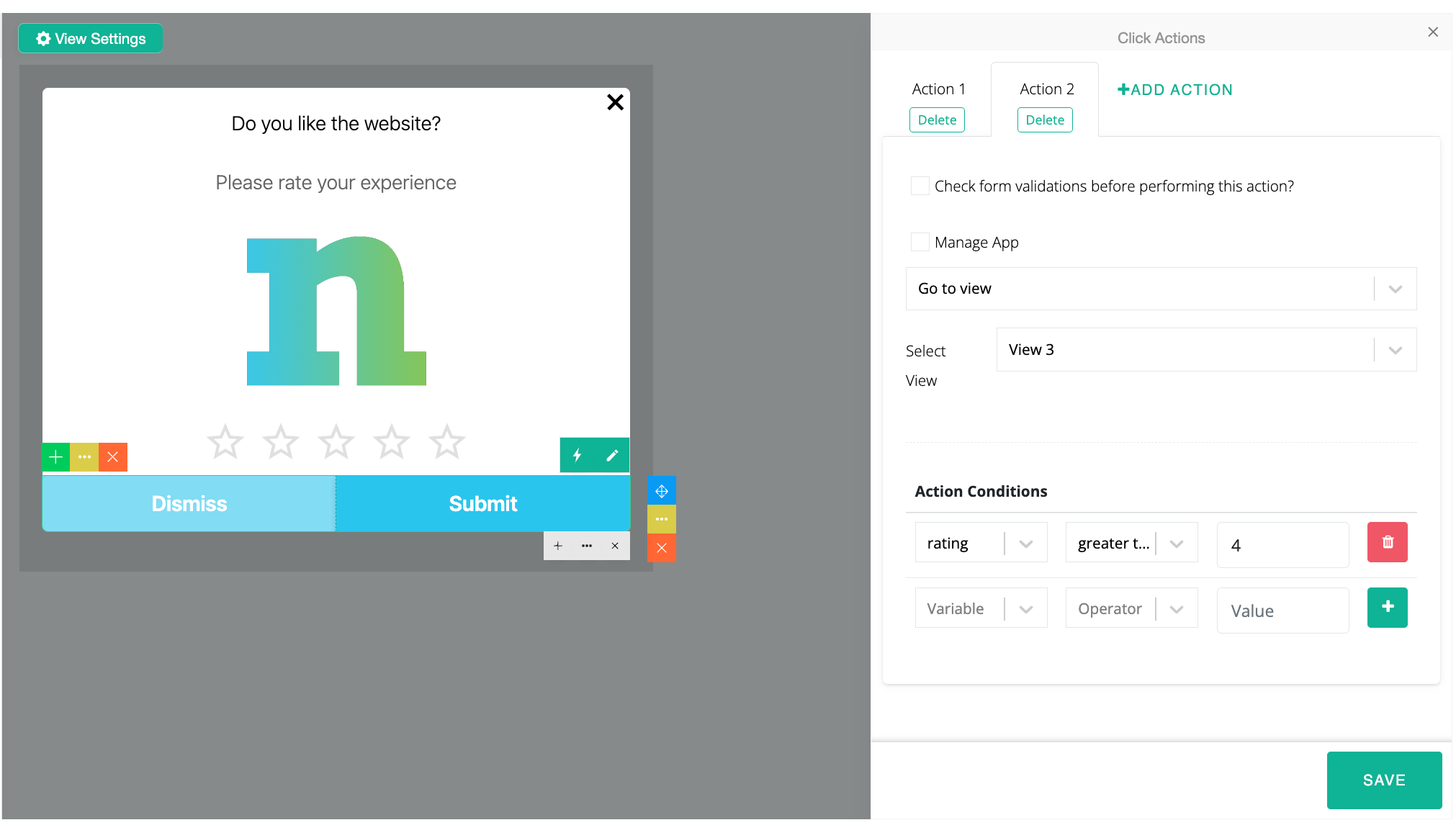
| **Go to View** | **View 3: Thank You** | `rating >= 4` |

Select **+ Add Action** before configuring the second outcome. Add further actions when the flow also sends data, redirects users, or fires an event.

{% columns %}
{% column %}

<figure><img src="/files/4RDRvYZrvSUEjVYweHGh" alt="Go to View condition for ratings of three or below" width="563"><figcaption><p>Ratings of three or below open the Feedback view.</p></figcaption></figure>
{% endcolumn %}

{% column %}

<figure><img src="/files/o7Xcay7SdAMjejgS7lQV" alt="Go to View condition for ratings of four or above" width="563"><figcaption><p>Ratings of four or above open the Thank You view.</p></figcaption></figure>
{% endcolumn %}
{% endcolumns %}

<figure><img src="/files/QZpgnGgVEuAFZNCxhBMK" alt="Action selection menu" width="563"><figcaption><p>Select an additional action when the flow needs it.</p></figcaption></figure>

Preview both rating paths. Then click **Save Widget and Return**.


---

# Agent Instructions
This documentation is published with GitBook. GitBook is the documentation platform designed so that both humans and AI agents can read, navigate, and reason over technical content effectively. Learn more at gitbook.com.

## Querying This Documentation
If you need additional information that is not directly available in this page, you can query the documentation dynamically by asking a question.

Perform an HTTP GET request on the current page URL with the `ask` query parameter, and the optional `goal` query parameter:

```
GET https://user.netmera.com/netmera-user-guide/omnichannel-engagement/widgets/build-a-widget/configure-widget-actions-and-validation.md?ask=<question>&goal=<endgoal>
```

`ask` is the immediate question: it should be specific, self-contained, and written in natural language.
`goal` is optional and describes the broader end goal you are ultimately trying to accomplish on behalf of the user. GitBook uses it to tailor the answer towards what is most useful for that goal.

The response will contain a direct answer to the question and relevant excerpts and sources from the documentation.

Use this mechanism when the answer is not explicitly present in the current page, you need clarification or additional context, or you want to retrieve related documentation sections.