> For the complete documentation index, see [llms.txt](https://user.netmera.com/netmera-user-guide/llms.txt). Markdown versions of documentation pages are available by appending `.md` to page URLs; this page is available as [Markdown](https://user.netmera.com/netmera-user-guide/omnichannel-engagement/feedback-button/create-feedback-button.md).

# Create feedback button

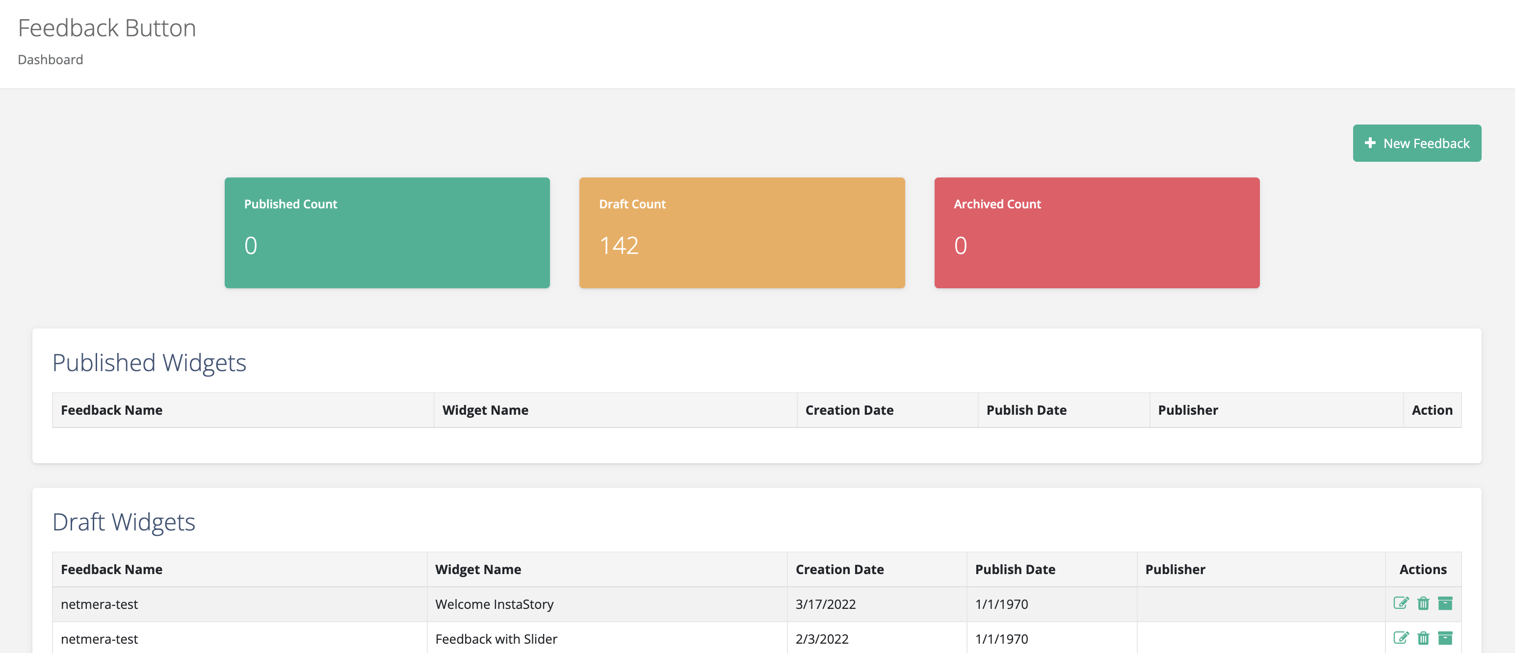
Use the feedback button dashboard to manage your widget drafts and published widgets.

* **Published count** shows widgets available to users.
* **Draft count** shows widgets you haven't published.
* **Archived count** shows widgets that are no longer active.

<figure><img src="/files/VtdNkx19p2sS3LDpCgad" alt="Feedback button dashboard showing published, draft, and archived widget counts."><figcaption><p>Feedback button dashboard</p></figcaption></figure>

The **Published Widgets** and **Draft Widgets** sections show each widget's feedback name, widget name, creation date, publish date, and publisher.

### Step 1: Feedback widget design

Choose a template or start with a blank widget.

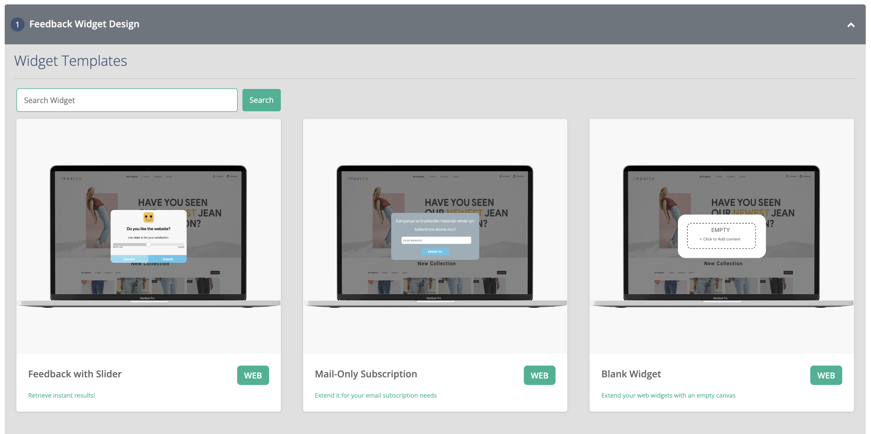
1. Select **Choose from Existing Widget Templates** to use a pre-designed layout.

   <figure><img src="/files/siXE4uZavD60liEt17Jm" alt="Widget template selection screen showing available feedback widget templates."><figcaption><p>Widget template selection</p></figcaption></figure>
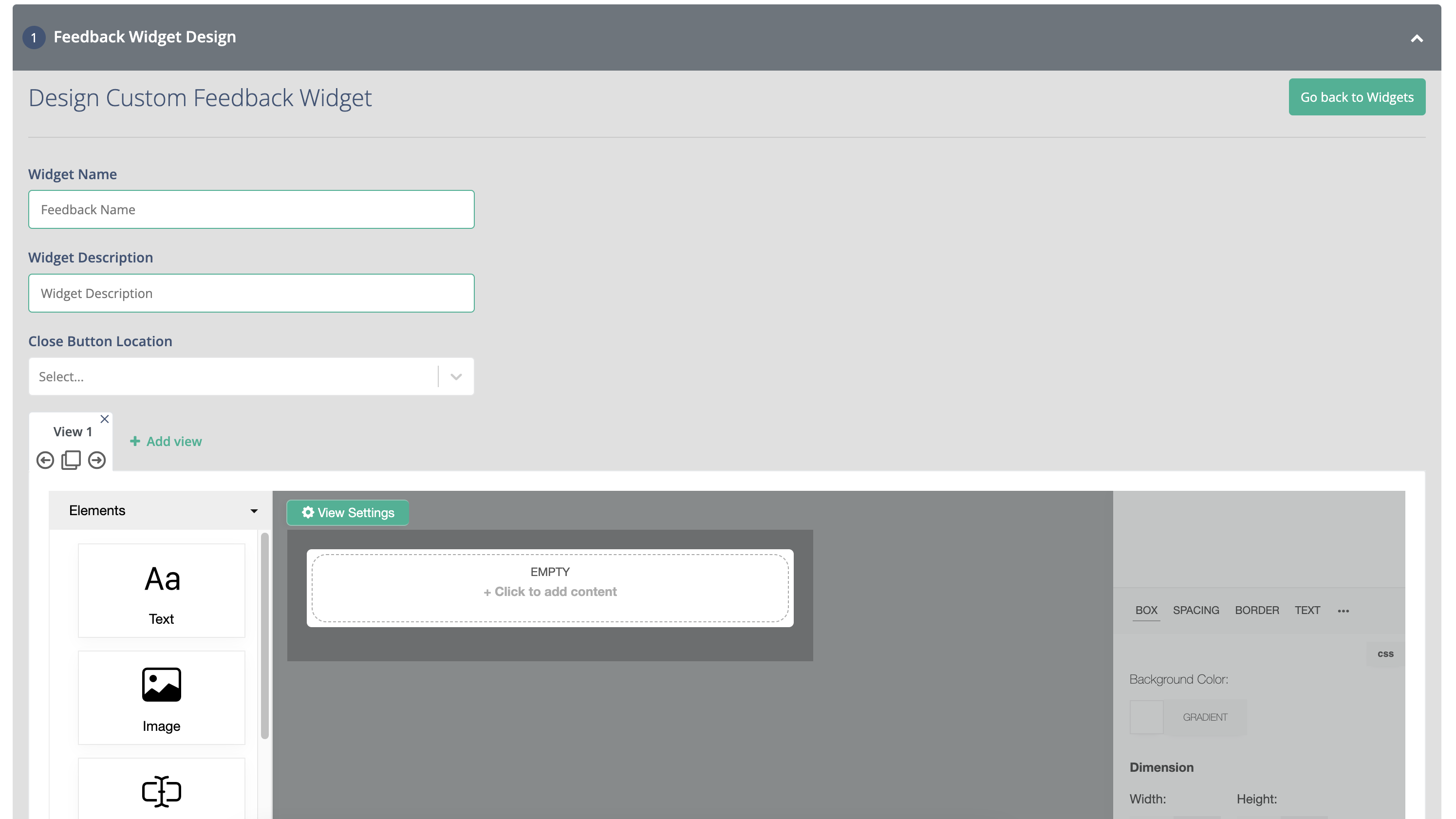
2. Select **Blank Widget** to create your own layout.

   <figure><img src="/files/IwW4a1utUE9rvKQhhvq0" alt="Widget design screen for creating a blank feedback widget."><figcaption><p>Blank widget design</p></figcaption></figure>

{% hint style="info" %}
Learn how to [Design widget layout](/netmera-user-guide/omnichannel-engagement/widgets/build-a-widget/design-widget-layout.md).
{% endhint %}

### Step 2: Feedback button appearance

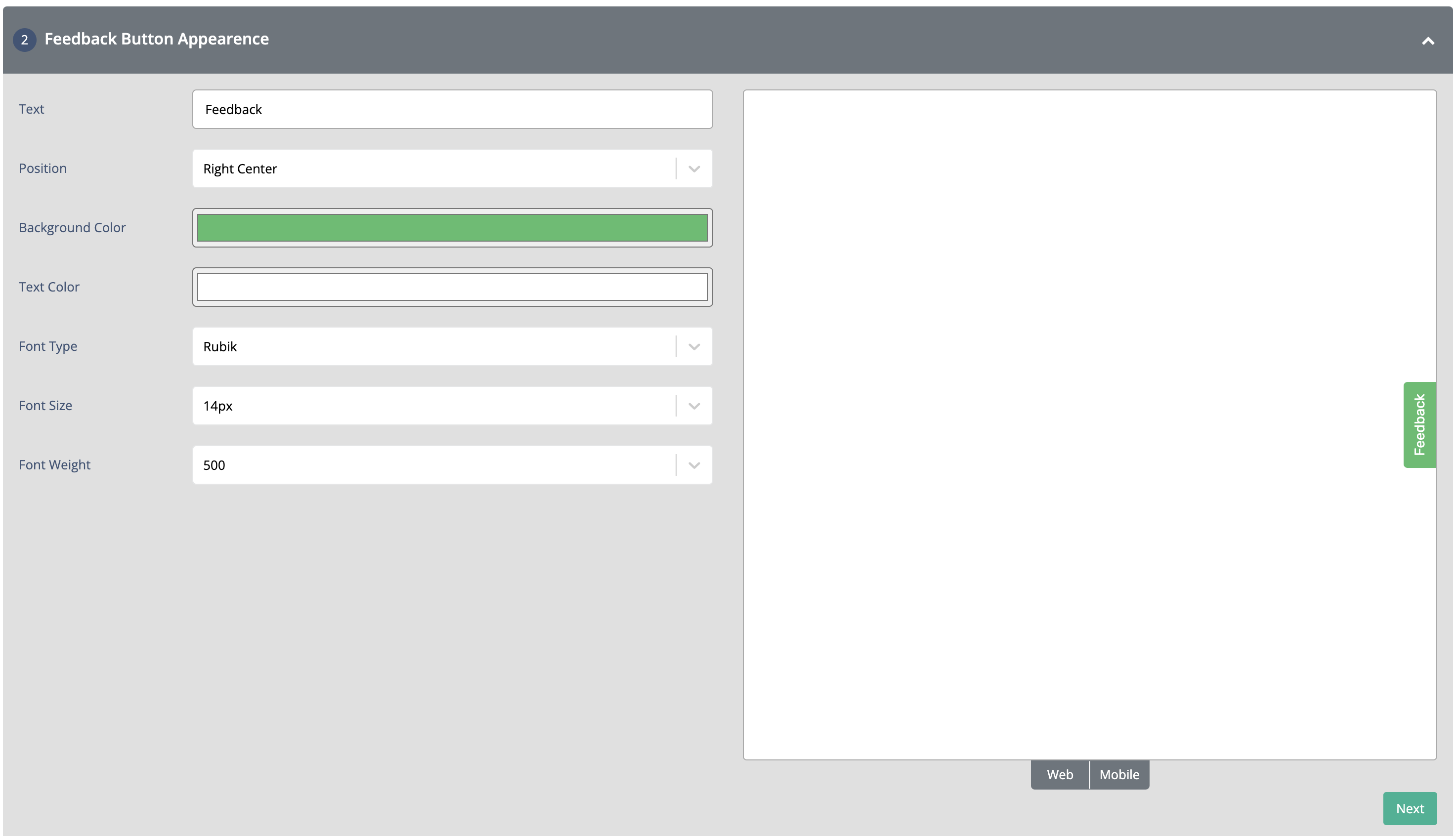
Configure the button's text position, background color, text color, font, font size, and font weight.

{% hint style="info" %}

### Preview the feedback button

To test the button, select **Web** or **Mobile** at the bottom of the preview page.
{% endhint %}

Configure how the Feedback Button looks and fits into your website or application.

<table><thead><tr><th width="223.2578125">Setting</th><th>Description</th></tr></thead><tbody><tr><td><strong>Text Feedback Position</strong></td><td>Defines where the feedback button text is displayed.</td></tr><tr><td><strong>Background Color</strong></td><td>Sets the background color of the button.</td></tr><tr><td><strong>Text Color</strong></td><td>Sets the color of the button text.</td></tr><tr><td><strong>Font Type</strong></td><td>Selects the font used for the button text.</td></tr><tr><td><strong>Font Size</strong></td><td>Defines the text size in pixels.</td></tr><tr><td><strong>Font Weight</strong></td><td>Controls how bold the button text appears.</td></tr></tbody></table>

<figure><img src="/files/eDkTk6ImAoqAOzAgmTnj" alt="Feedback button appearance settings with web and mobile preview controls."><figcaption><p>Feedback button appearance settings</p></figcaption></figure>

### Step 3: Targeting

Set the conditions that determine who sees the feedback button.

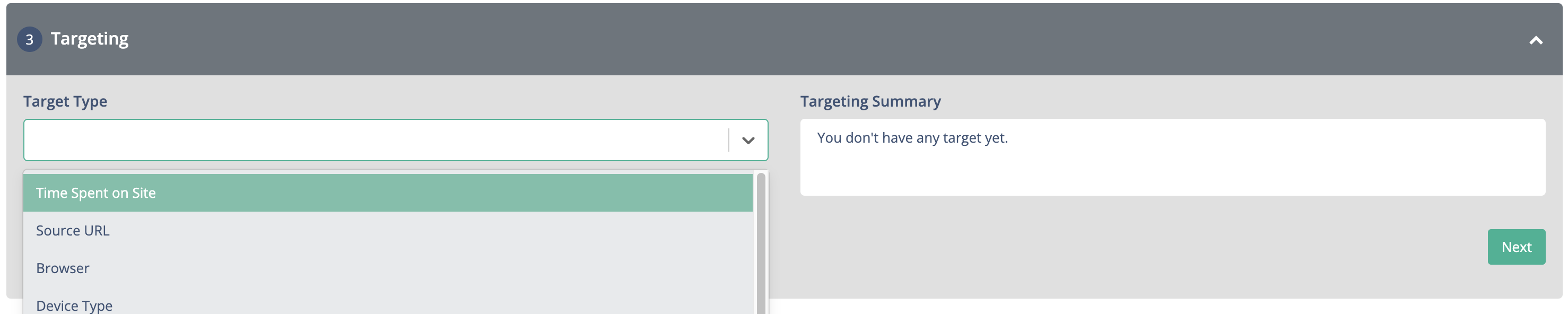
Select a target type based on time on site, source URL, browser, device type, operating system, cookies, screen width, location, segment, or tag. Review **Targeting Summary** to confirm your criteria.

<figure><img src="/files/75hELBJQI9i9b53hLx4s" alt="Feedback button targeting settings showing targeting criteria and a summary."><figcaption><p>Feedback button targeting settings</p></figcaption></figure>

### Step 4: Rules

Set the trigger and timing rules for the feedback button.

#### Trigger types

Choose a trigger that matches the user behavior you want to capture:

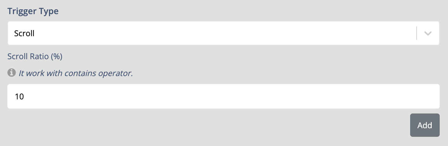
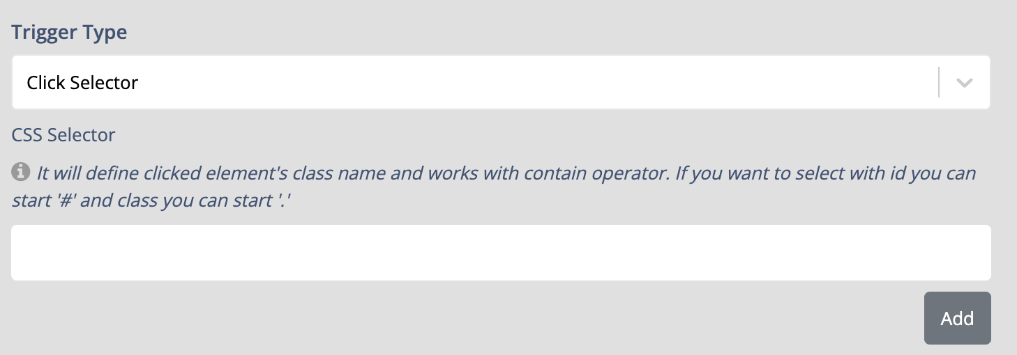
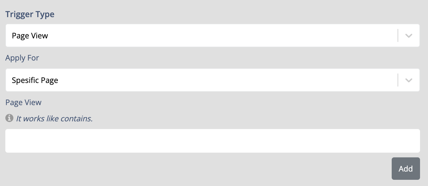
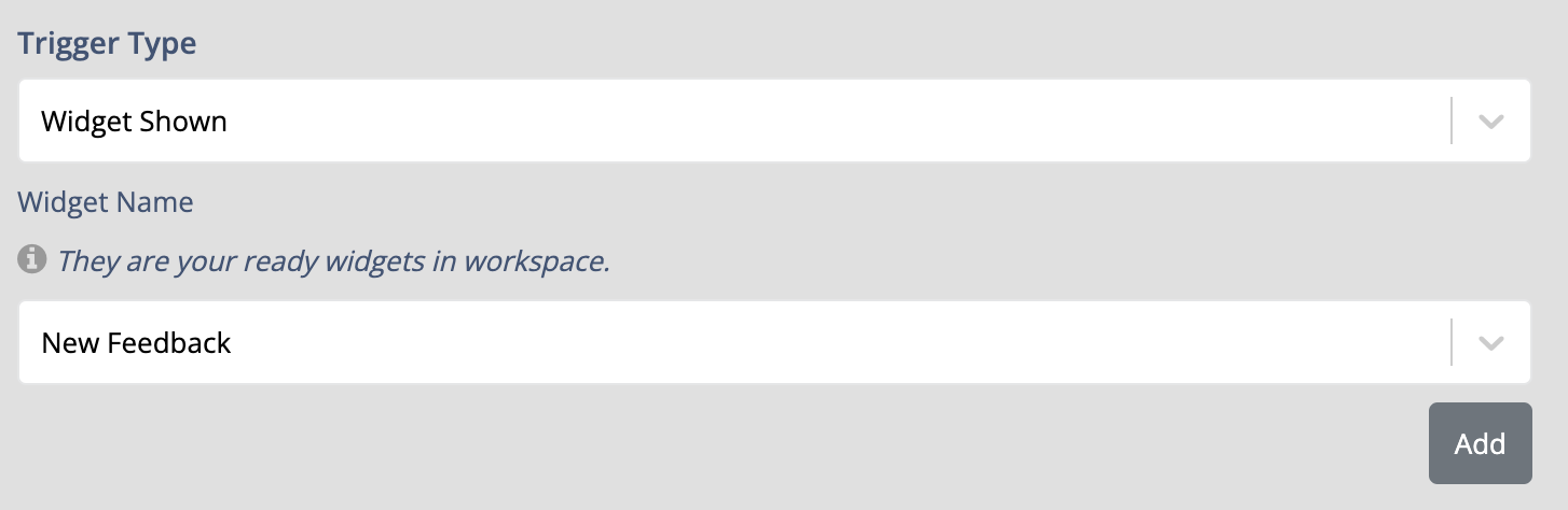
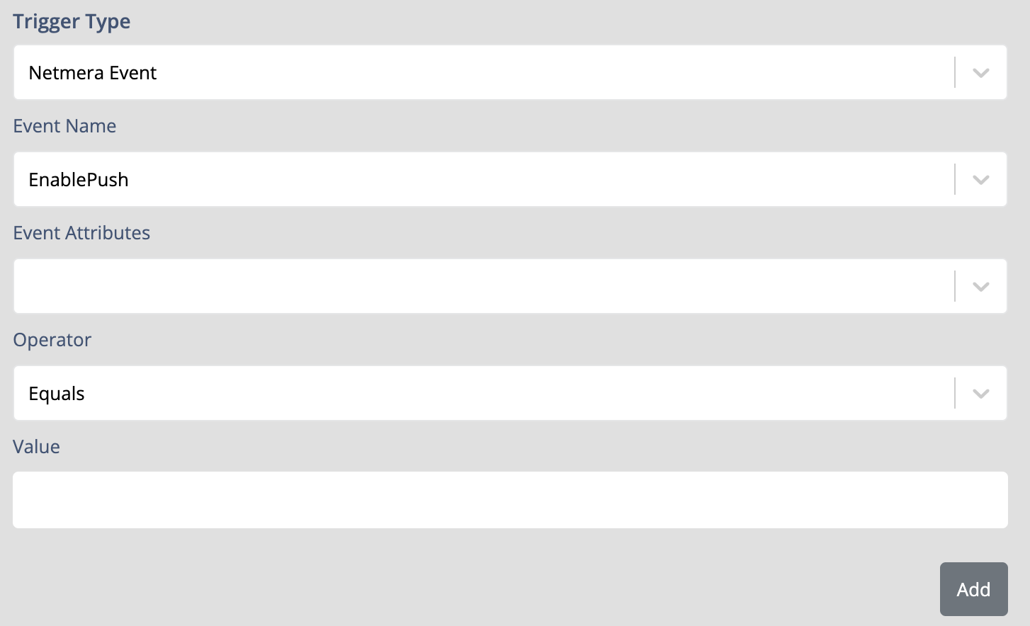
<table><thead><tr><th width="211.671875">Trigger Type</th><th>Description</th></tr></thead><tbody><tr><td><strong>Scroll Trigger</strong></td><td>Display the Feedback Button after the user scrolls beyond a specified percentage of the page, such as 50% or 75%.</td></tr><tr><td><strong>Click Selector Trigger</strong></td><td>Display the Feedback Button when the user clicks a specific page element. Identify the element using its CSS selector, class, or ID.</td></tr><tr><td><strong>Page View Trigger</strong></td><td>Display the Feedback Button when the user visits a specific page or set of pages.</td></tr><tr><td><strong>Exit Intent Trigger</strong></td><td>Display the Feedback Button when the system detects that the user is about to leave the page.</td></tr><tr><td><strong>Widget Shown Trigger</strong></td><td>Display the Feedback Button after another selected widget has been shown to the user. This can be used to create sequential widget experiences.</td></tr><tr><td><strong>Netmera Event Trigger</strong></td><td>Display the Feedback Button when a specified Netmera event occurs. Configure the event name, attributes, operators, and values that determine when the trigger is activated.</td></tr></tbody></table>

<figure><img src="/files/75qx2S7meFOhKGdq7Ftn" alt="Scroll trigger settings for a feedback button." width="563"><figcaption><p>Scroll trigger settings</p></figcaption></figure>

<figure><img src="/files/De8zCcs4VCSW4GqrrKh3" alt="Click selector trigger settings for a feedback button." width="563"><figcaption><p>Click selector trigger settings</p></figcaption></figure>

<figure><img src="/files/EylNRvUqFHsmkDCFnSuz" alt="Page view trigger settings for a feedback button." width="563"><figcaption><p>Page view trigger settings</p></figcaption></figure>

<figure><img src="/files/8bubsZTIqOWEmuLtQaoL" alt="Exit intent trigger settings for a feedback button." width="563"><figcaption><p>Exit intent trigger settings</p></figcaption></figure>

<figure><img src="/files/zrVaY46wJK23CPeHo32Z" alt="Widget shown trigger settings for a feedback button." width="563"><figcaption><p>Widget shown trigger settings</p></figcaption></figure>

<figure><img src="/files/raShvmCij7G0PCmKANf3" alt="Netmera event trigger settings for a feedback button." width="563"><figcaption><p>Netmera event trigger settings</p></figcaption></figure>

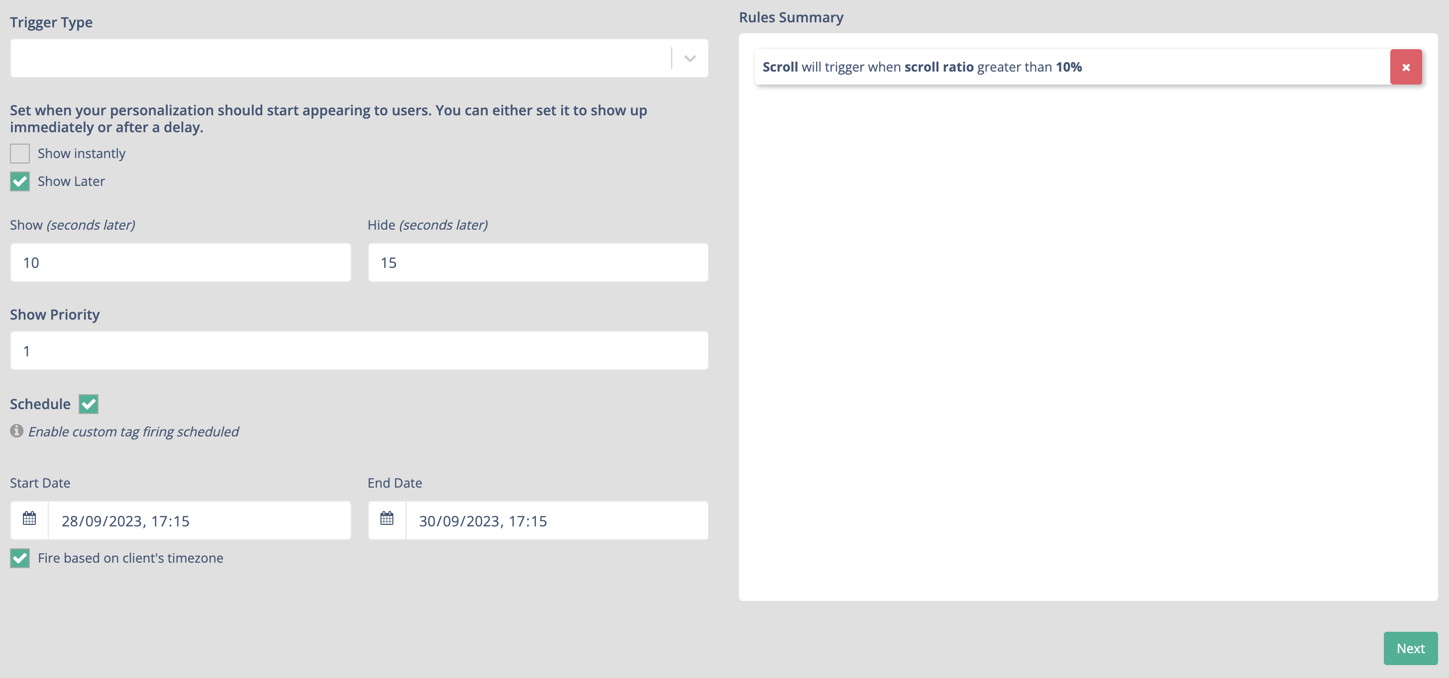
#### Configure display timing

Define when the Feedback Button starts appearing after its conditions are met.

* **Show instantly** — Displays the Feedback Button immediately.
* **Show Later** — Delays the appearance of the Feedback Button.
* **Show (seconds later)** — Specifies how many seconds to wait before displaying the button.
* **Hide (seconds later)** — Specifies how many seconds the button remains visible before it disappears.
* **Show Priority** — Determines the display order when multiple widgets have similar trigger conditions.

#### Schedule the Feedback Button

Use **Schedule** to define when the Feedback Button is active.

* **Start Date** — Defines when the Feedback Button becomes active.
* **End Date** — Defines when the Feedback Button stops being active.
* **Fire based on client's timezone** — Uses the user's device timezone when determining the widget's behavior.

Review **Rules Summary** to confirm the configured trigger, timing, priority, and schedule.

<figure><img src="/files/sXlkRZCYMxQc9EpyIQWa" alt="Feedback button rules settings showing display timing, priority, and schedule options."><figcaption><p>Feedback button rules settings</p></figcaption></figure>

### Step 5: Summary

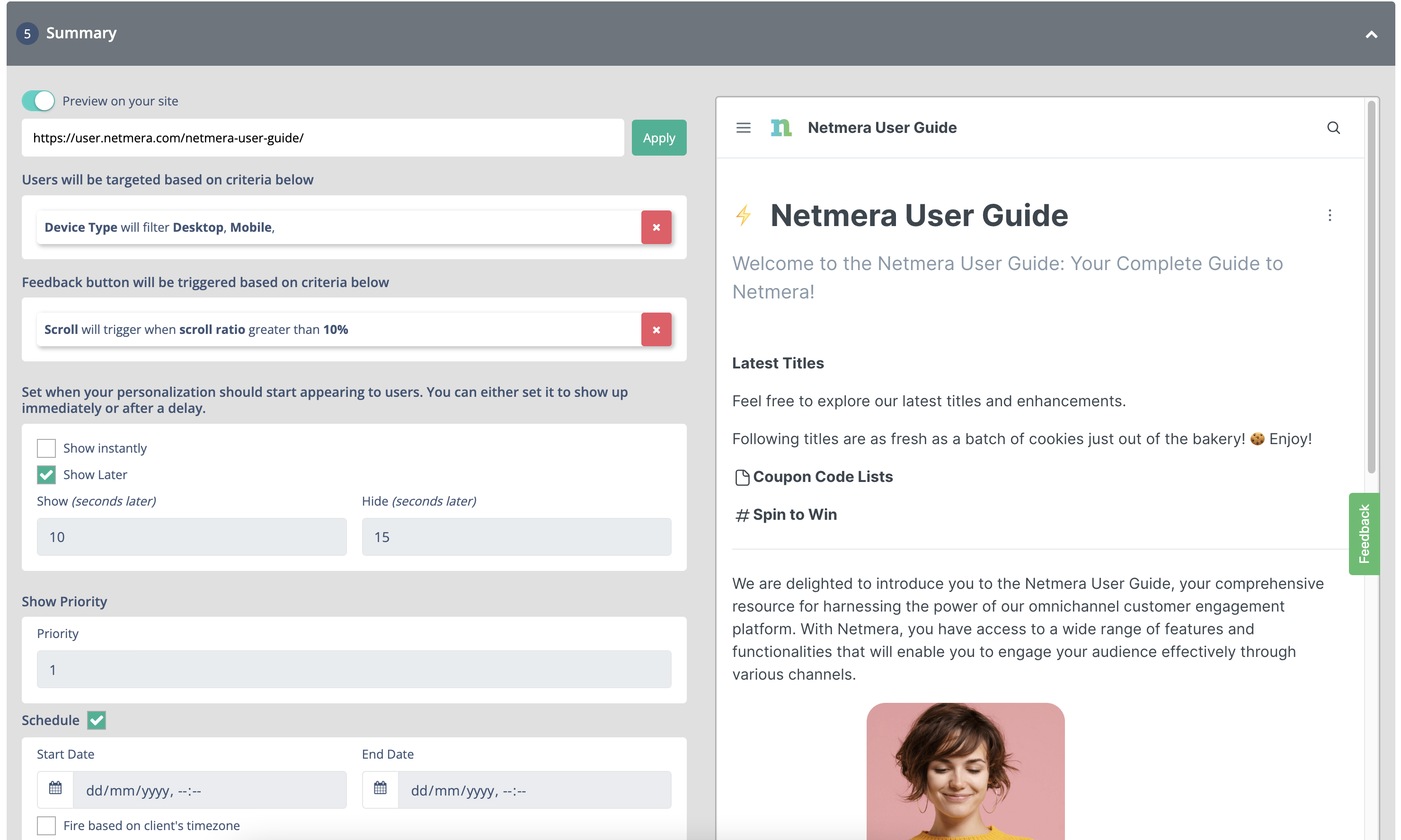
The Summary step provides an overview of the configuration before the Feedback Button goes live.

Review the following sections:

* **Preview on Your Site** — Preview how the Feedback Button will appear.
* **Users Will Be Targeted Based on Criteria Below** — Review the configured audience conditions.
* **Feedback Button Will Be Triggered Based on Criteria Below** — Review the configured trigger conditions.
* **Set When Your Personalization Should Start Appearing to Users** — Review the display timing and schedule.

<figure><img src="/files/qJ2z8zbNAOzc45garTLM" alt="Feedback button summary showing a preview, targeting criteria, rules, and publishing options."><figcaption><p>Feedback button summary</p></figcaption></figure>

{% hint style="info" %}

### Preview the feedback button

To test the button, select **Web** or **Mobile** at the bottom of the preview page.
{% endhint %}

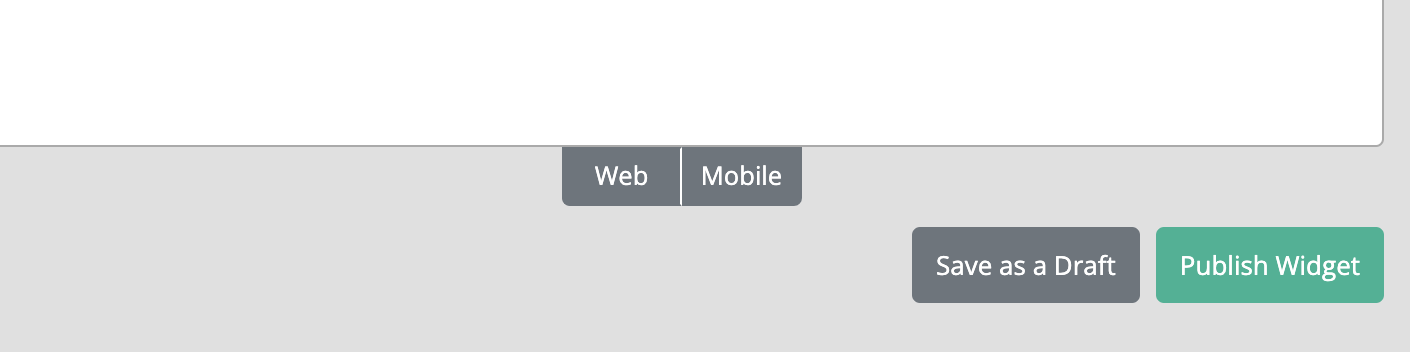
Select **Save as Draft** to save your work without publishing it.

<figure><img src="/files/wstwyeHnt23Tjcta1TBu" alt="Feedback button publishing screen with Save as Draft and Publish Widget options." width="563"><figcaption><p>Save or publish the feedback button</p></figcaption></figure>


---

# Agent Instructions
This documentation is published with GitBook. GitBook is the documentation platform designed so that both humans and AI agents can read, navigate, and reason over technical content effectively. Learn more at gitbook.com.

## Querying This Documentation
If you need additional information that is not directly available in this page, you can query the documentation dynamically by asking a question.

Perform an HTTP GET request on the current page URL with the `ask` query parameter, and the optional `goal` query parameter:

```
GET https://user.netmera.com/netmera-user-guide/omnichannel-engagement/feedback-button/create-feedback-button.md?ask=<question>&goal=<endgoal>
```

`ask` is the immediate question: it should be specific, self-contained, and written in natural language.
`goal` is optional and describes the broader end goal you are ultimately trying to accomplish on behalf of the user. GitBook uses it to tailor the answer towards what is most useful for that goal.

The response will contain a direct answer to the question and relevant excerpts and sources from the documentation.

Use this mechanism when the answer is not explicitly present in the current page, you need clarification or additional context, or you want to retrieve related documentation sections.